Destination Discovery Platform for Digital Nomads
Studio C&G Inc. | Website | Travel
Finding the right destination as a digital nomad often requires comparing large amounts of scattered information across multiple sources. This project explores how a smarter destination discovery platform could use guided user inputs to create a more personalized and efficient way to search, evaluate, and compare potential cities.
Designed as a web experience for digital nomads, the platform helps users move from open-ended research to more relevant recommendations based on their lifestyle, priorities, and travel needs. The goal was to reduce research friction, make destination information easier to navigate, and support more confident decision-making.
Company
Canada-based Startup Company
Tools
Figma,
FigJam,
Figma Make,
Perplexity AI
Roles
End-to-End UX Design,
UX Research & Strategy
Deliverables
Research Findings,
Service Blueprints,
Wireframes,
High-Fidelity UI
Client name and branding have been anonymised in accordance with a non-disclosure agreement. All work shown reflects my own design contributions.
This project focused on two core goals: making destination discovery more personalized, and helping users evaluate options more efficiently through a clearer web experience.
Create a more personalized discovery experience
Use guided inputs to surface more relevant destination suggestions and reduce research overwhelm.
1
Support confident destination evaluation
Present destination information in a clearer, more structured way to support faster and more confident decisions.
2
To better understand how digital nomads research destinations, I conducted 5 user interviews, reviewed common travel-planning behaviors, and analyzed existing destination platforms.
Planning the next destination often means comparing cost, weather, internet quality, safety, and lifestyle fit across multiple sources. Because that information is scattered across blogs, forums, spreadsheets, and travel tools, the process becomes slow, fragmented, and hard to compare.
The research showed that users needed more than access to destination content, they needed a clearer way to discover places that matched their priorities and a more efficient way to evaluate options side by side. This created an opportunity for a more guided and personalized discovery experience.
What We Learned
Scattered research sources
Users rely on multiple tools and platforms to gather the information they need.
1
Hard to compare destinations
Important factors are not presented in a consistent or comparable way.
2
High research effort
Users spend too much time narrowing options before they can make a confident decision.
3
A key part of the concept was making destination discovery feel more guided and relevant from the start. Instead of asking users to browse a large set of destinations on their own, the experience begins with a short quiz that captures practical preferences such as budget, weather, lifestyle, and travel priorities.
These inputs create a more personalized starting point for exploration by surfacing destinations that better match the user’s needs. This helps reduce information overload, narrows the decision space earlier, and makes the overall discovery experience feel more focused and actionable.

Preferences

Personalized Suggestions

Destination Details

Side-by-side comparison
The final experience was designed to help users move from broad exploration to more confident decision-making. Rather than presenting destinations as a static content library, the platform was structured around three key ideas: guiding discovery through personalization, making destination details easier to evaluate, and supporting side-by-side comparison across cities.
Guide discovery through personalization
The experience begins with a more guided entry point that helps users narrow a large set of destinations into more relevant options. By combining onboarding-style inputs with curated results, the platform reduces the effort required to start exploring and gives users a clearer path into the content.
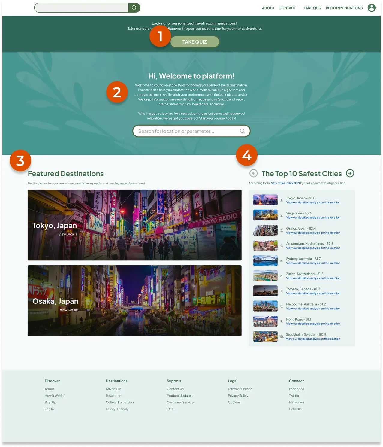
Homepage
Users seeking personalized recommendations can take the quick quiz to discover their next destination.
Manual search functionality for specific destinations or related travel data.
Featured Destinations highlights popular and trending destinations to spark user inspiration.
The Ranking section features categorized recommendations based on key data points
Quiz and Personalized Results
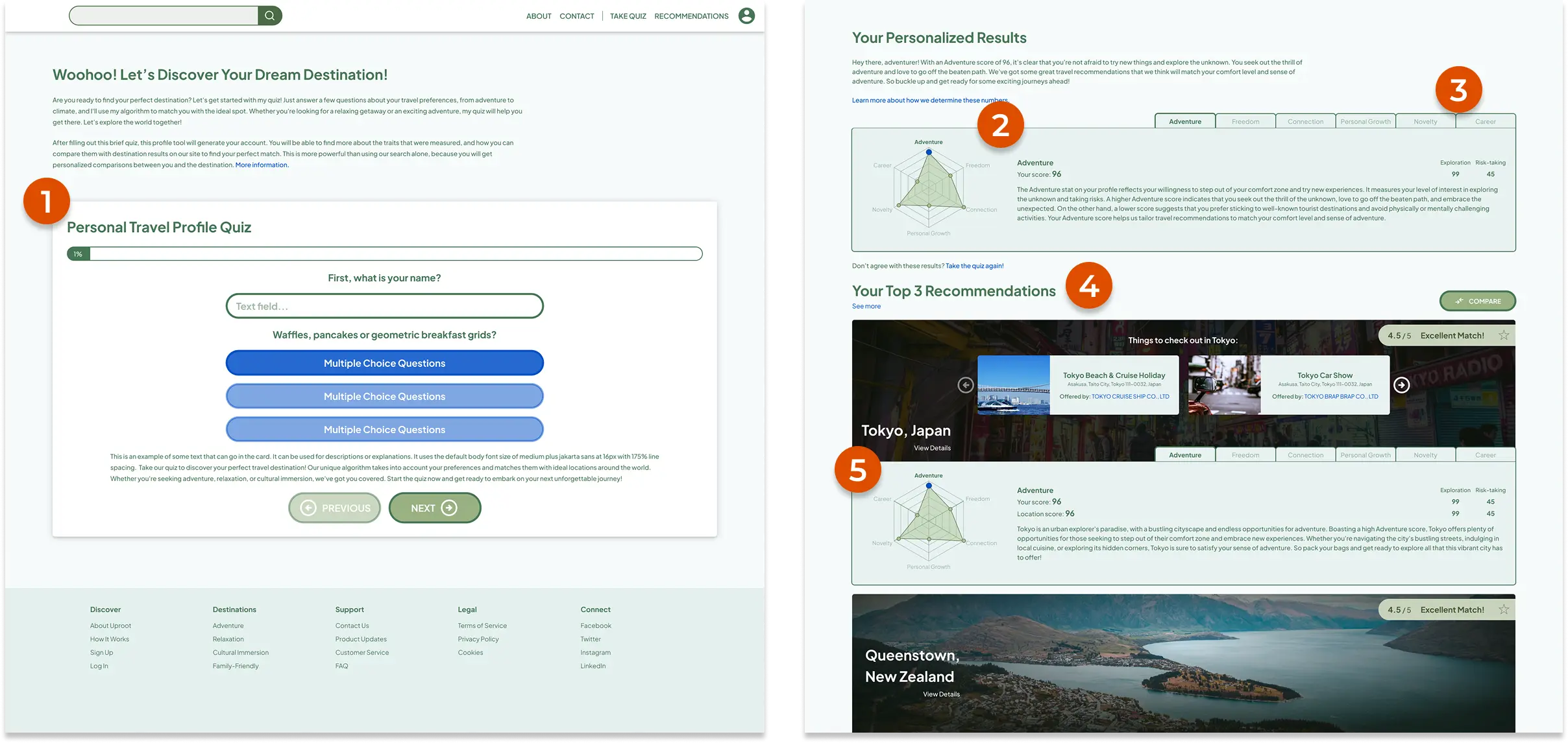
Users answers a few questions about their travel preferences to generate a personalized results.
Results are displayed in a radar chart, which visualizes scores across different dimensions such as adventure, personal growth, and lifestyle preferences.
Detailed explanations for each dimension are organized into tabs, allowing users to switch between them for more information.
Top 3 destination recommendations are shown under user’s score.
Each destination features its own scores and radar chart, helping users understand why this is good match for them.
Make destination details easier to evaluate
Once users discover a promising destination, the experience helps them assess it through structured and easier-to-scan information. The destination detail view was designed to surface the practical factors digital nomads care about most, making it easier to understand tradeoffs and evaluate fit without jumping between multiple sources.
Destination Details
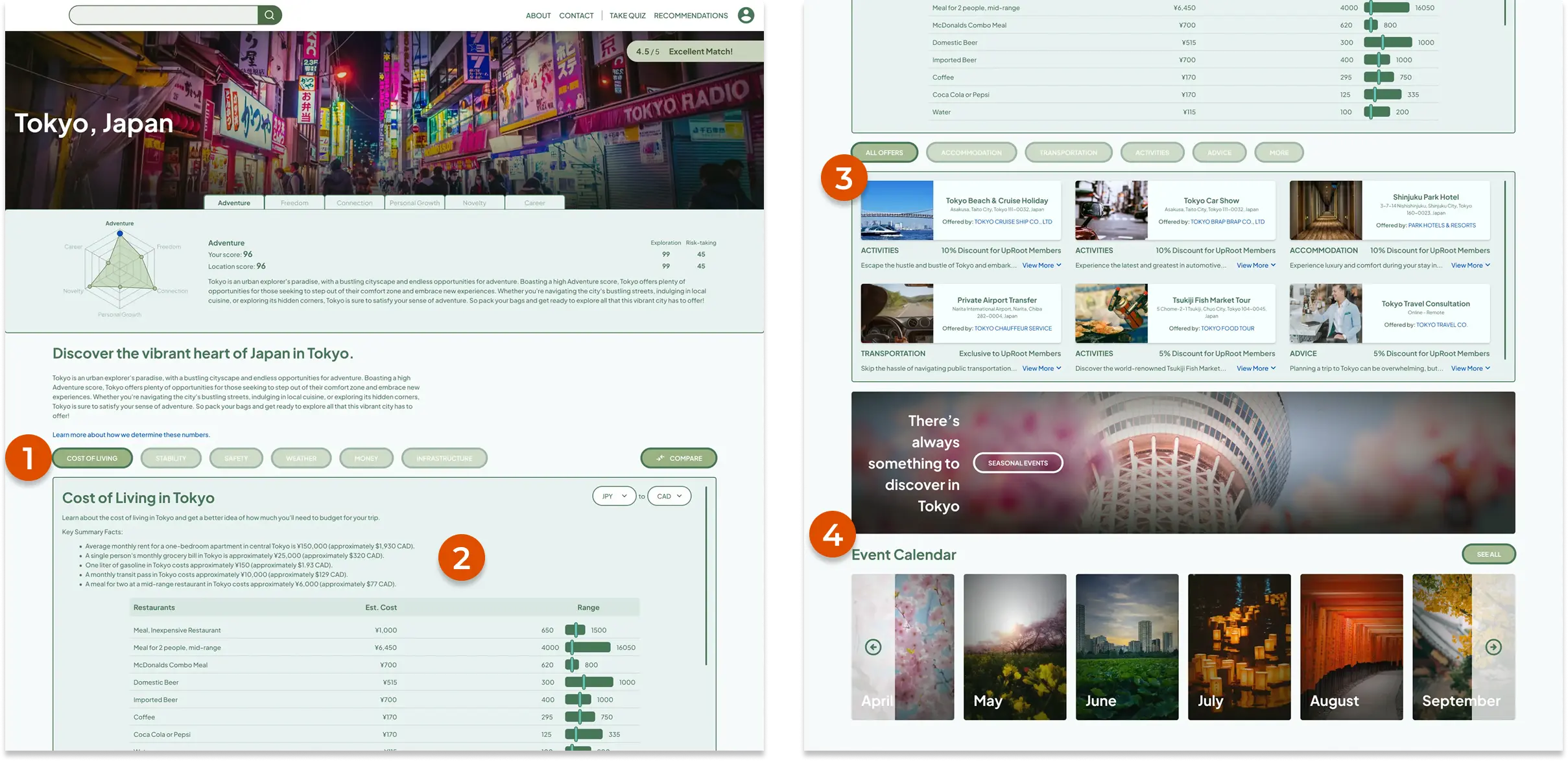
The details page provides a comprehensive breakdown of city data, including cost of living, safety ratings, and other metrics.
Key Summary Facts presents a snapshot of the essential data for quick evaluation and comparison.
Offers section serves as a up-selling feature, allowing the platform to collaborate with travel agencies, airlines, etc to provide exclusive deals to users.
Event Calendar highlights top activities throughout the year, helping users decide the best time for their visit.
Support confident comparison across cities
Choosing where to go next often depends on comparing multiple destinations against practical needs and personal priorities. The comparison experience was designed to make those differences easier to understand by presenting key factors side by side, helping users review options more efficiently and make decisions with greater confidence.
Destinations Comparison
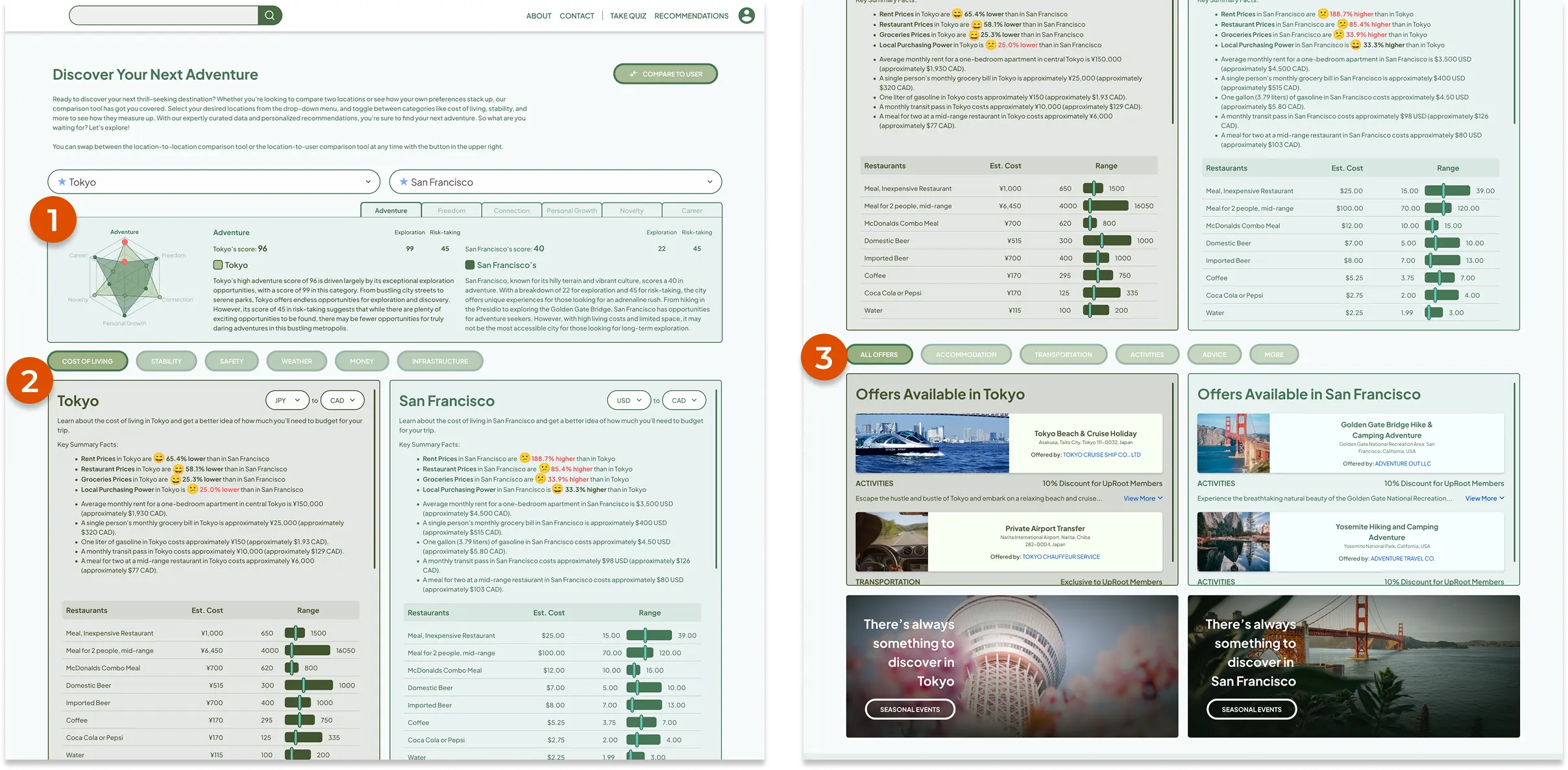
Overlapping radar chart shows a direct scoring comparison, highlighting the key differences between selected cities.
A side-by-side data breakdown for the users, the Key Summary Facts section provides the most significant data differences
Offers section also available in this page to show the exclusive deals.
Outcome
Usability testing showed strong early results, with a 4.7/5 user satisfaction score and a 95% task success rate across key discovery tasks. The results suggested that the experience was easy to navigate, clear to understand, and effective in helping users explore and compare destinations more confidently.
Reflection
This project highlighted the value of combining personalization with clear information architecture. A better discovery experience is not just about surfacing options, but about helping users narrow choices, evaluate tradeoffs, and move toward a decision with less friction.