
HOME+ Mobile App Redesign
HKBN | Mobile App | E-Commerce
HOME+ is HKBN's e-commerce app, a platform for daily essentials and lifestyle products serving a broad consumer base in Hong Kong. On paper, it had everything it needed. In practice, users were dropping off during product discovery and getting lost on the way to checkout. A 2.2/5 app rating, a 73% drop-off rate, and survey feedback pointing to frustration at nearly every step of the journey told a clear story: the experience had real structural problems, not just surface-level ones.
I owned the full redesign from leading research and diagnosis through journey restructuring, interface design, and design system build. The goal wasn't just a visual refresh; it was rebuilding the shopping flow in a way that actually worked for how people browse and buy. After launch, conversion rate was improved by 32% and active users grew by 38%.
Company
Hong Kong Broadband Network - HOME+
Tools
Figma,
FigJam,
Google Analytics,
SurveyMonkey
Roles
End-to-End UX Design,
UX Research & Strategy,
Mentoring junior designers
Deliverables
User Journey Maps,
High-Fidelity UI Specs, Prototype,
Design System
My Role
I led the end-to-end design process for the mobile app redesign, from research and problem framing to journey definition, wireframing, and final UI design. I identified key experience gaps in the existing product, translated research into redesign priorities, and shaped the updated shopping flows across discovery, product, cart, and checkout. The project also involved applying the refreshed brand identity to the product and contributing to a more scalable design system for future growth.
I also collaborated closely with stakeholders and supported junior designers through design direction, feedback, and alignment across the project.
The brief came with three directions that weren't always naturally aligned. Hit commercial targets, fix usability issues that were hurting real shoppers, and make everything feel like the new brand. The design decisions throughout had to hold up against all three.
Improve conversion across key shopping journeys
Fix the drop-off points in browsing, product pages, and checkout that were stopping people from completing purchases.
1
Make mobile shopping easier to navigate and act on
Improve discovery, search, filtering, and browsing so users can shop faster and with more confidence.
2
Align the product experience with the new HOME+ brand
Create a more cohesive experience that reflects the refreshed brand direction, and could scale to the website without needing to start over.
3
To identify where the current app was creating friction, I reviewed the existing experience through multiple research methods, including current-state analysis, survey data, user interviews, and competitor review. The goal was to understand where the shopping journey was breaking down, what was affecting customer confidence, and which issues were most likely to impact conversion.
What We Learned
Research showed that the biggest problems were concentrated in the moments that mattered most to purchase completion. Users struggled with homepage clarity and first impressions, found product discovery and filtering less intuitive than expected, and experienced uncertainty in the cart and checkout flow. These issues made it harder for users to browse confidently, compare products efficiently, and complete purchases without friction.
Reviewing the current experience
I first audited the existing app to understand how the experience performed across the core shopping journey. This helped identify usability gaps in the homepage, search and filter behavior, product detail pages, cart interactions, and checkout flow.
The homepage was showing some meaningless graphics and text content with no clear entry point and lack of any hierarchy to signal what mattered. Filters were technically there but hard to use: results didn't always match what users thought they were filtering for. And the cart made delivery costs and conditions hard to read until users were already mid-checkout.
Customer signals and user pain points
The survey and interview findings mapped closely onto what the audit flagged. Users weren't struggling with one thing, the frustration built up across the whole journey. But the cart and checkout stood out: that's where the clearest drop-off happened and where users had the most to say.
Insights from the survey:
2.2 / 5
2.2 / 5 is the scores of respondents rate the HOME+ App
4 / 5
4 / 5 is the scores of respondents rate how difficult to use the app
(5 / 5 = most difficult)
38%
38% of respondents said they were able to find the product they want easily
73%
73% of respondents said Checkout would be the feature need an improve
Insights from the interview:
Poor Overall Impression & Homepage Utility
Overall app performance and visual design lagged behind competitors. Furthermore, users found the homepage layout unintuitive and less useful than industry standards.
1
Friction in Product Discovery (Search & Filters)
Participants struggled to find the products they wanted. The search function frequently returned irrelevant results, and the product filters were a major source of frustration due to poor usability.
2
High Cart Abandonment Risk (Cart & Checkout)
The path to purchase is heavily flawed. Users were confused by the delivery arrangements in the cart, and every single participant experienced friction during checkout. Overall, the checkout flow was deemed too lengthy, with users strongly desiring a more streamlined journey.
3
Competitive patterns and opportunity areas
I also reviewed competitor experiences to understand how similar products supported browsing, promotions, search, and purchase flow. This helped clarify which patterns users already expected and where HOME+ had an opportunity to create a stronger and more intuitive shopping experience.
What worked well in the market

Strong filtering and search patterns helped users narrow large product catalogs more efficiently.
Reorder-friendly interactions supported frequent shopping behavior and reduced friction for repeat purchases.
Some platforms introduced more advanced discovery features, such as visual search, that made browsing feel faster and more engaging.
What created friction

Homepage experiences often became visually crowded, making it harder for users to know where to focus.
Inconsistent merchant content and product presentation weakened trust and made comparison more difficult.
Overly gamified experiences added noise and distracted from the core shopping journey.
Business context and market opportunity
HOME+ launched into a market where HKTVmall had already established a dominant position, not because their product was better, but because they got there first. By the time HOME+ entered, HKTVmall had the user base, the brand recognition, and the habitual customers. HOME+ had competitive pricing, fast delivery, and HKBN's infrastructure behind it. On paper, strong. In practice, those advantages weren't converting.
A year after launch, the numbers weren't where they needed to be. Sales targets were missed, growth was stalling, and a 2.2/5 app rating was actively suppressing downloads. Management made the call: a full rebrand paired with a platform-wide revamp across the app and website.
The risk of doing nothing was straightforward. Sales would stay flat, organic growth would stall, and HKTVmall's head start would only widen. This wasn't an exploratory redesign. It was a business recovery effort with a clear commercial mandate.
With the research across audit, surveys, interviews, and competitor review done, the patterns were clear enough to reframe as design directions. I organized them into four areas that connected the research findings to where the redesign needed to focus.
Fix the homepage, not enough directing users to what they actually want. Need to have functional features upfront.
1
Search and filters need to work the way users expect. Right now they're a source of frustration, not a shortcut.
2
Cart and checkout are where purchase decisions die. Simplify the flow and make delivery information legible before users reach payment.
3
Bring the design language in line with the new brand. Not just visually, but in how it communicates trust and usability.
4
These opportunity areas became the foundation for restructuring the shopping journey. From there, I mapped a revised experience focused on clearer discovery, smoother decision-making, and a more efficient path to checkout.
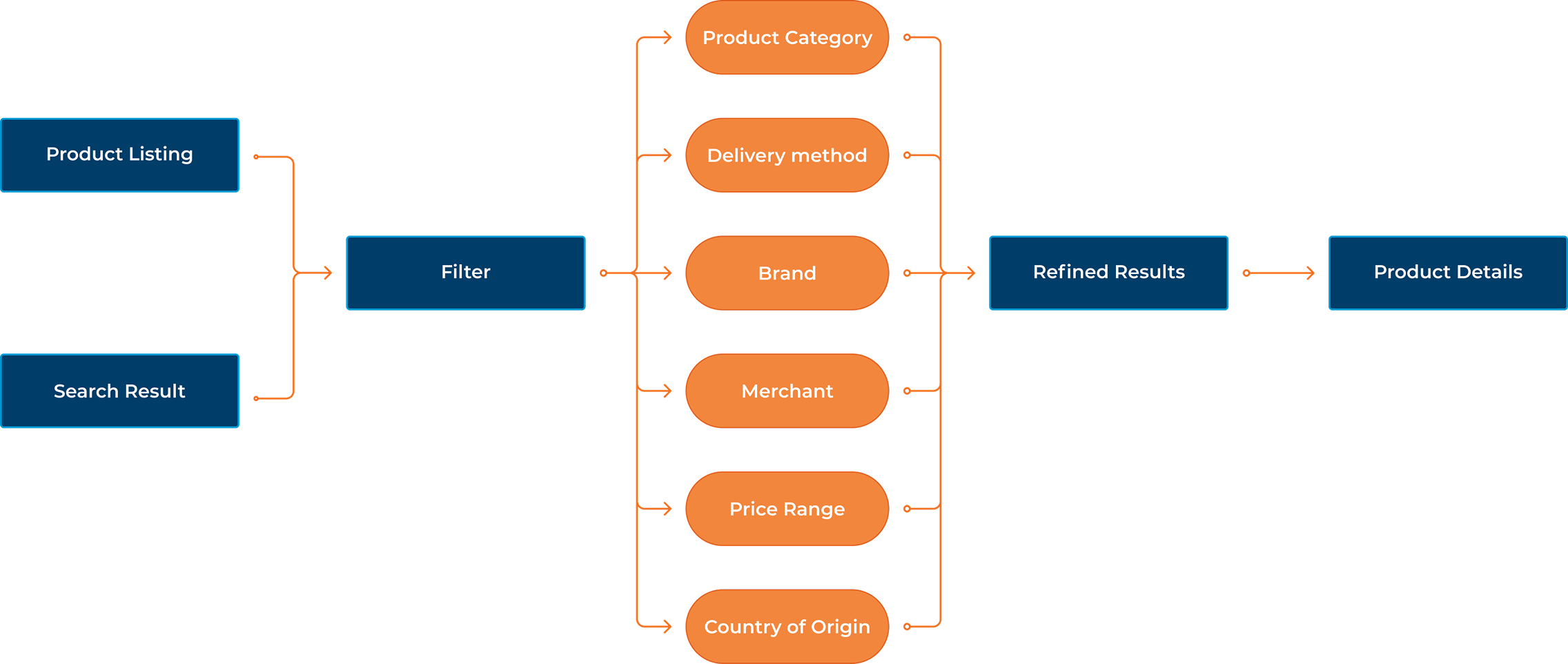
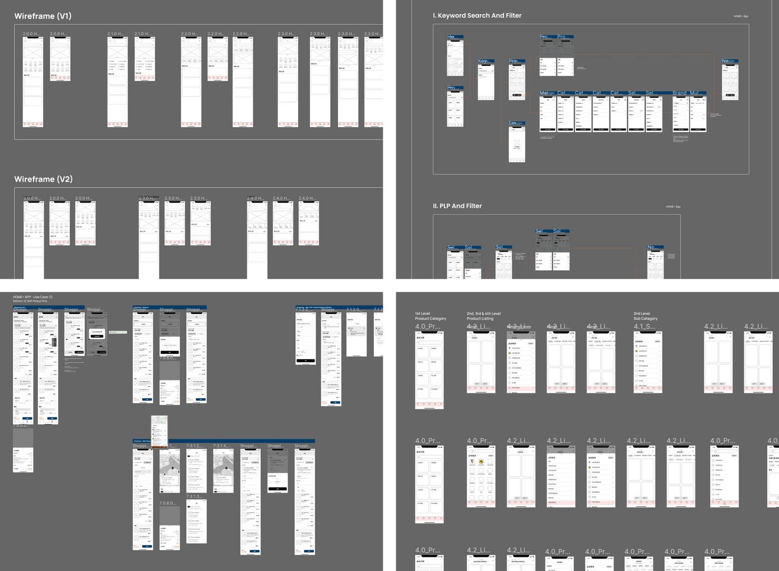
The research made it clear that the current journey had the right steps in the wrong order, and some steps that didn't need to exist at all. Before touching screens, I remapped the flows for the three core paths: navigation, search, and filtering to figure out where the structure itself was the problem.
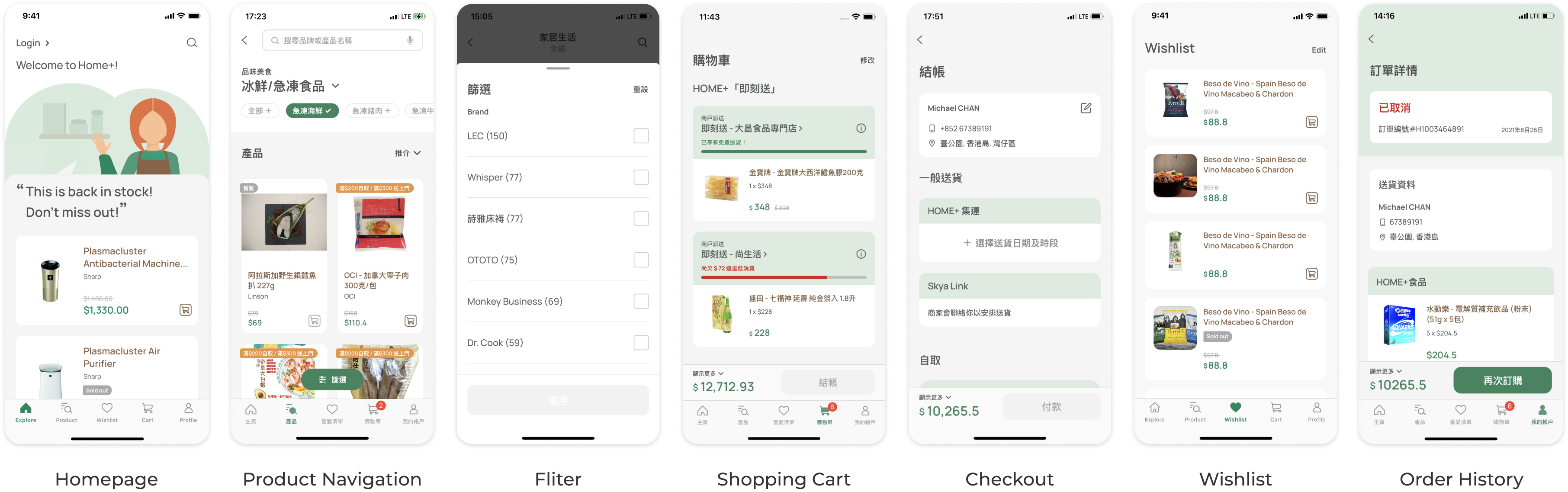
Navigation Structure
The navigation structure was one of the earliest and most debated decisions. HOME+'s product catalogue runs deep, some categories span four to five levels of subcategories which meant the navigation model had to handle real complexity without punishing users for it. Google Analytics data on the existing app showed significant drop-off happening at exactly these multi-step navigation points. Forcing users through even more steps wasn't a direction we could justify.
We explored two alternatives before landing on the final approach. The decision was to use bottom navigation to land users directly on a major category listing, then let them filter and refine from there. This shifted the complexity from the navigation layer to the browsing layer, a more forgiving model where users could see products immediately and narrow down at their own pace.
Product Navigation:
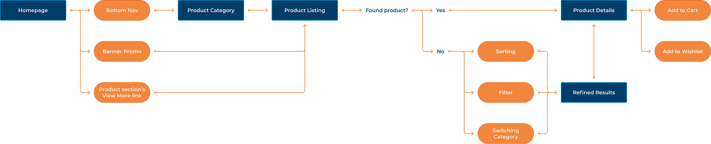
Product Searching:
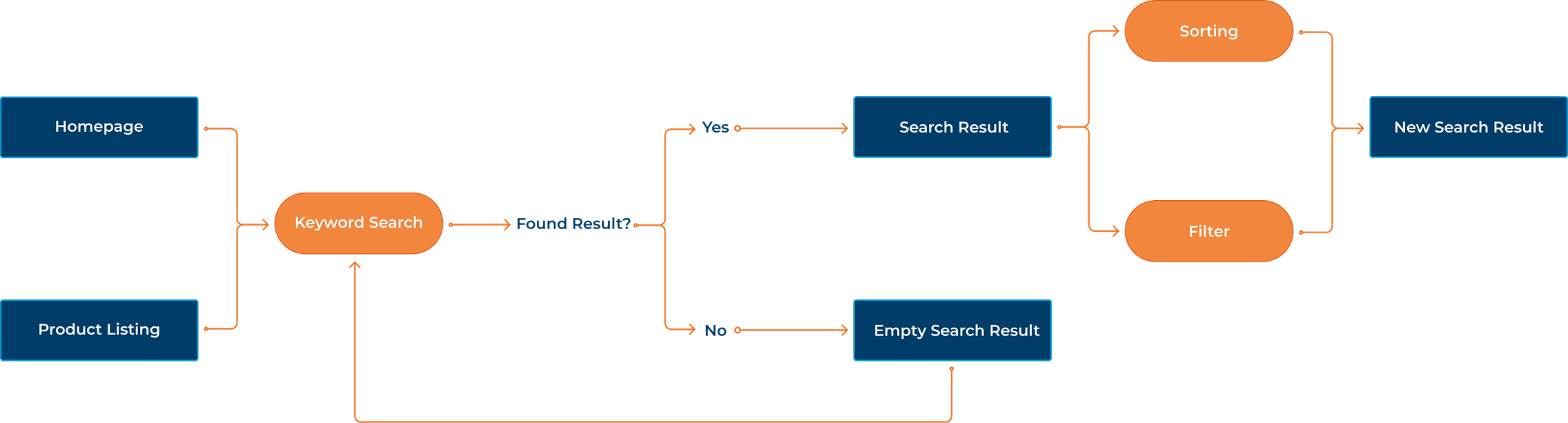
Product Filtering:
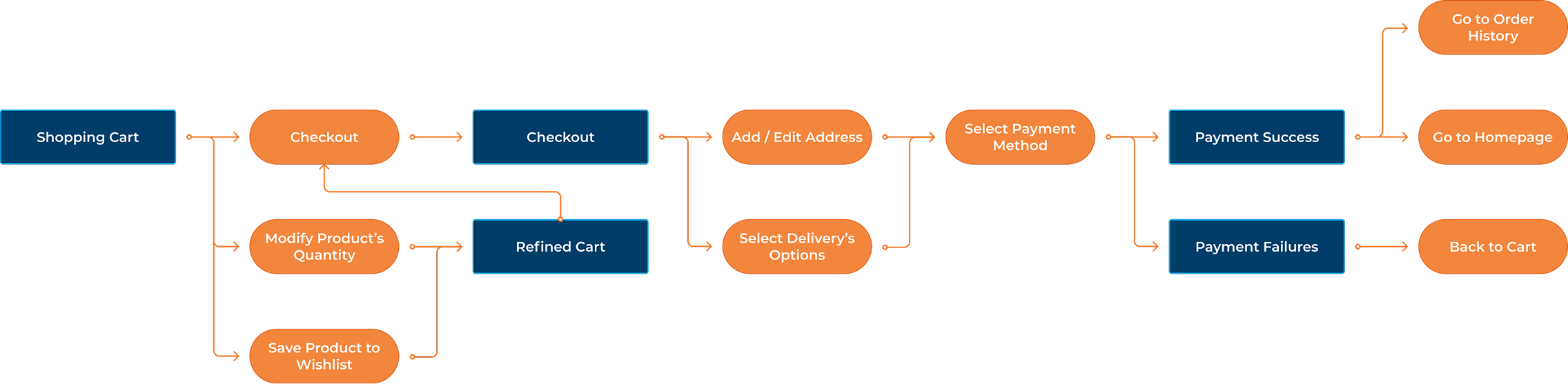
Shopping Cart and Checkout
Checkout flow was another major pain point we had. The original flow ran four steps, but the bigger problem wasn't the steps. It was the shipping policy. The minimum threshold for free shipping was hard to reach and confusing to communicate, and it was driving drop-off before users even got to payment.
Rather than designing around it, I brought the finding to the business team and we simplified the policy together. That single change removed the biggest friction point in the flow before we touched the interface.
On the design side, we reduced the steps from four to two. The business wanted upsell modules in the checkout flow but I pushed back. Checkout is a moment of commitment, and introducing distractions there increases the chance users abandon. We kept the path clean and focused on getting users to the confirmation screen.
What We Learned
The dev team had early concerns about how the new journey would work in practice. Rather than trying to explain it in a spec document, we built an interactive prototype they could actually try. Walking through it together in review sessions resolved most of the questions and got everyone aligned before a single line of code was written.
These revised flows provided the structural foundation for the next phase of the redesign, where I translated the updated journey into interface concepts, system patterns, and final UI decisions.
Once the flows were mapped, I moved into early concepts to figure out how they'd actually work on screen. The wireframes weren't about aesthetics, they were a way to pressure-test layout decisions and catch hierarchy problems before the design system work began.
The final designs were built on top of everything that came before: the research, the remapped flows, and the wireframe iterations. Each screen had a clear job tied back to one of the four opportunity areas, which made the design decisions easier to explain and easier to defend.
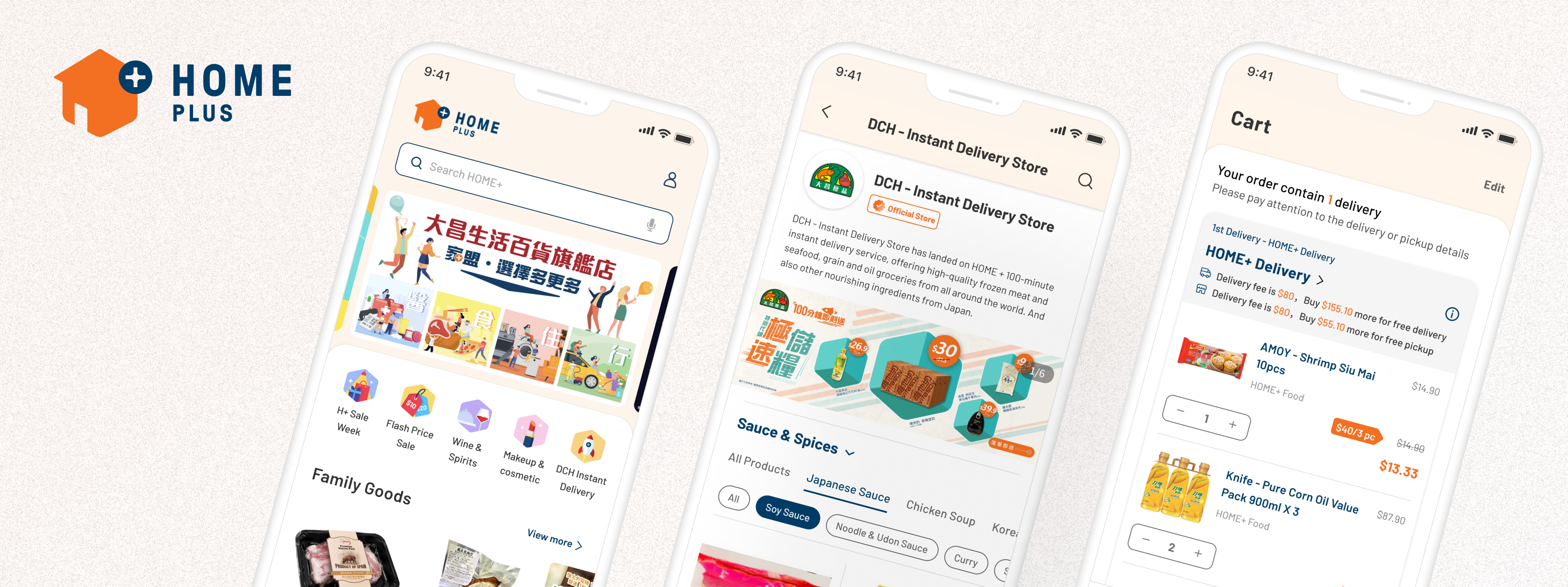
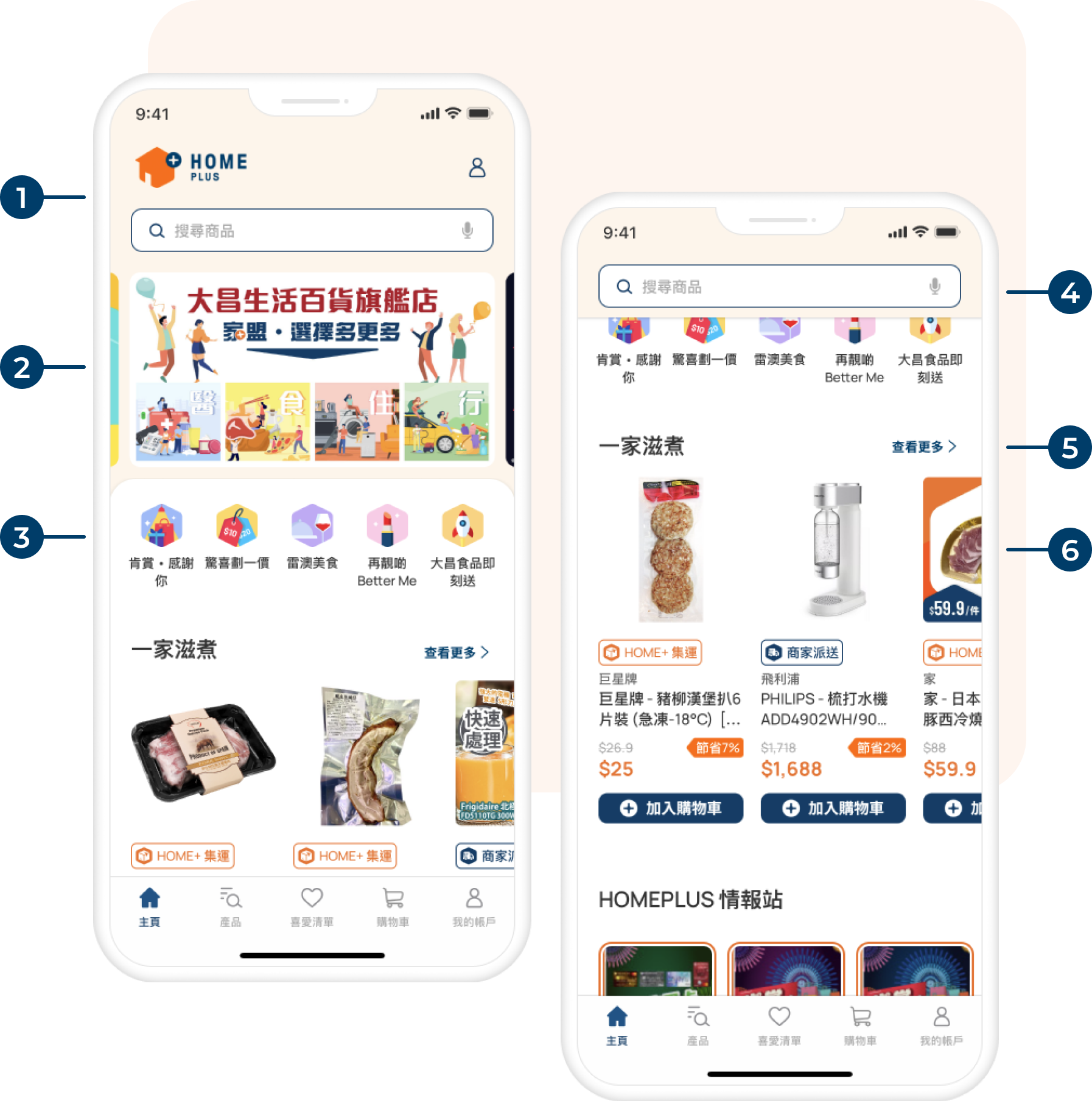
Improve browsing clarity
The homepage was not useful and confusing. The redesign gave it one job: help users get oriented quickly and move toward what they came to find. Categories got more structure, promotions got a dedicated space, and the hierarchy was tightened so the most important actions were visible without scrolling.
Revamped Design

New Top Navigation design with HOME+ logo, Login button and Full Width Search Bar

Carousel for promotions and offers

Icon button as quick links of product category

Sticky Search Bar while users scrolling

View more link for leading users to product listing

Redesigned Product Grid
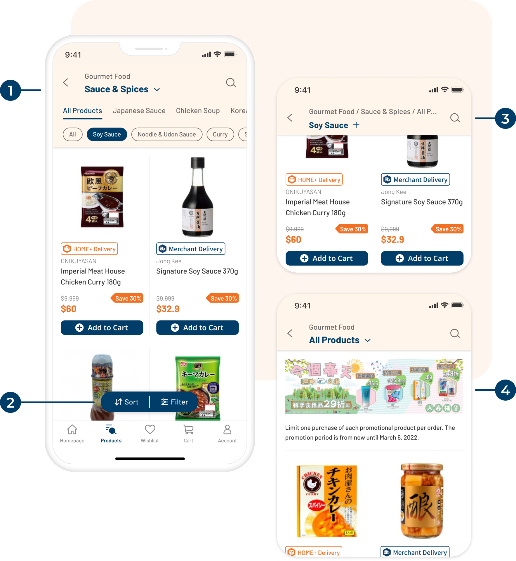
Make discovery easier
The catalog depth was a genuine design challenge, some categories went four or five levels deep. The redesign pushed complexity down into the filtering layer rather than the navigation, so users could land somewhere useful immediately and refine from there instead of picking their way through nested menus before seeing a single product.
Revamped Design - Product Listing Page
New Top Navigation design that can cater 4 level of category and switching category quickly
Redesigned floating button for Sorting and Filter
Collapsed Top Navigation while scrolling to avoid blocking users view the product
If users want to switch category, they can simply click on it and it will transform back to normal
New promotion area in PLP, able to place banner and text description
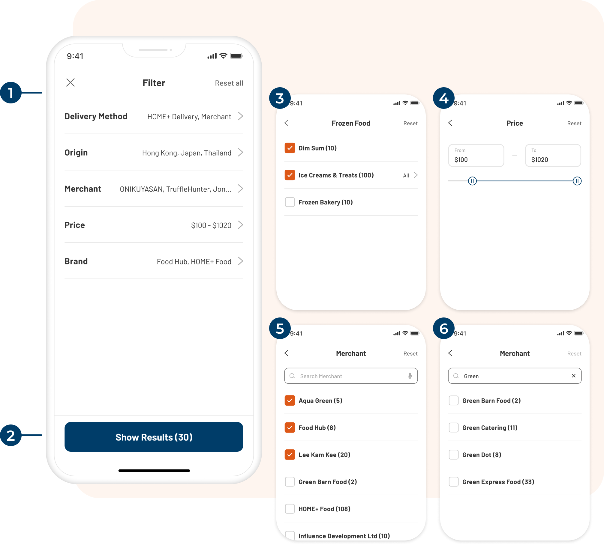
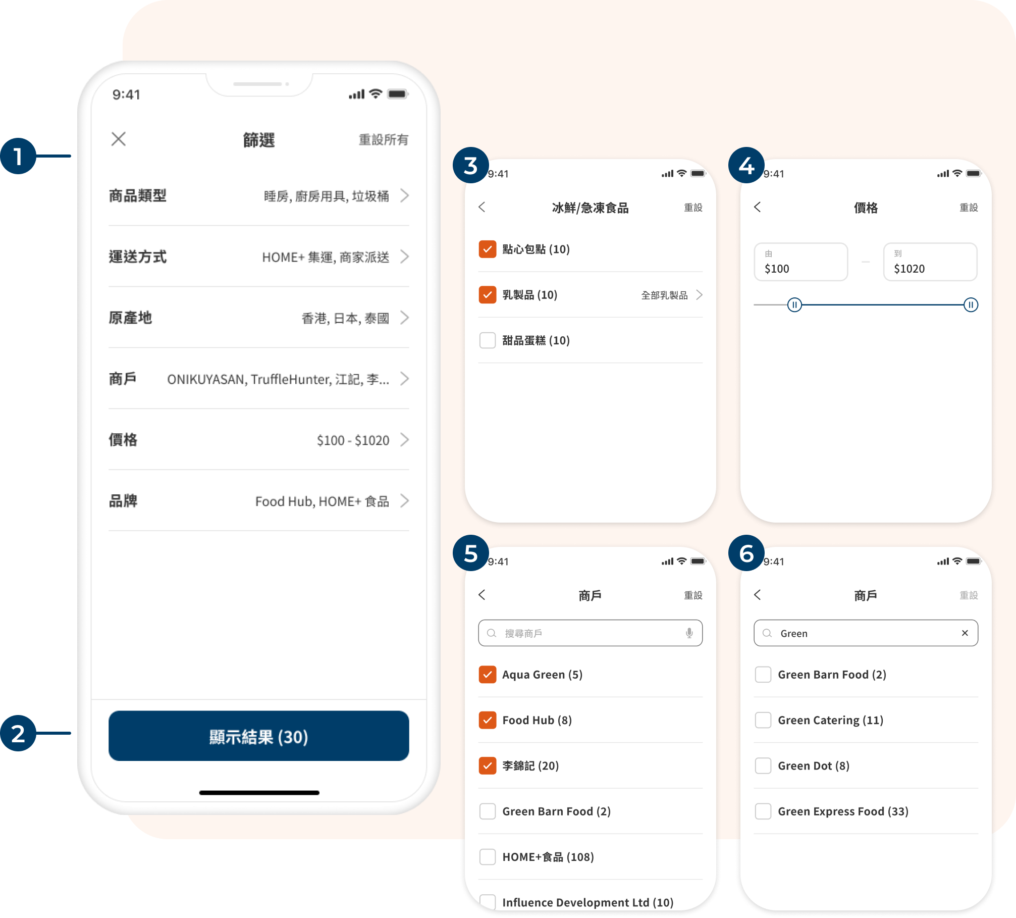
Revamped Design - Filter
Revamped Filter applied collapse approach, all parameters are in a collapsed state and users can expand them one by one to select values
Number of results will be shown on CTA button
Product category filter for search result only. Users can use this filter while using keyword search
Price range filter, users can input the number directly or drag the slider
For Brand, Merchant and Origin filter, the design are same. Users can multi select from the list or search by keywords
Matched search results will be shown on the list
Support purchase decisions
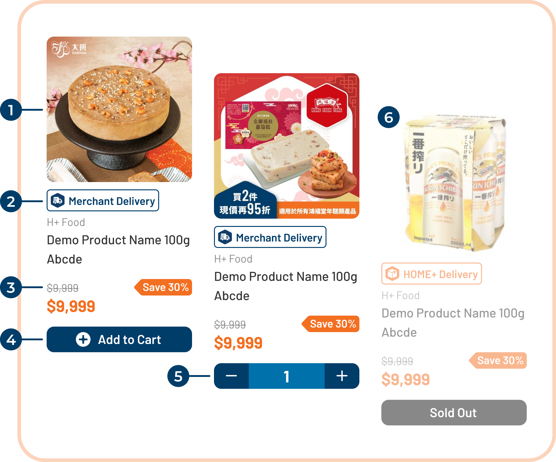
Product pages needed to do more work. Users were making decisions like comparing sizes, checking delivery methods, spotting promos. The old layout buried the information they needed to feel confident adding something to cart. The redesign surfaced delivery details earlier, made sale indicators clearer, and gave the Add to Cart action more visual weight.
Revamped Design - Product Grid
Enlarged product image to make it more eye-catching
Redesigned tag to indicate the delivery methods
Added a promo tag for sale items, to indicate the sale %
Redesigned Add to Cart button, more prominent and easy to click
When users clicked Add to Cart, the button will become Adjust Quantity button. Users can adjust the quantity they wanted to purchase
More prominent disabled status for sold out items
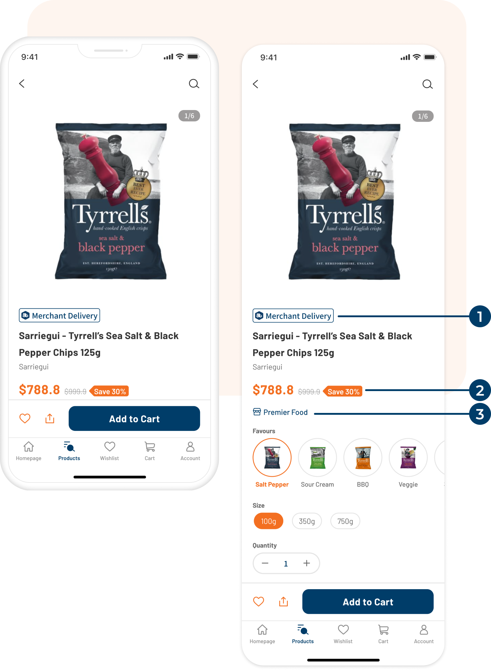
Revamped Design - Product Details
Relocated and redesigned Delivery Remarks. Let the users notice the delivery method of this product quickly
Added a promo tag for sale items, to indicate the sale % or other offers
Add Merchant link button. User will be redirected to the merchant’s product listing after clicking it
Reduce checkout friction
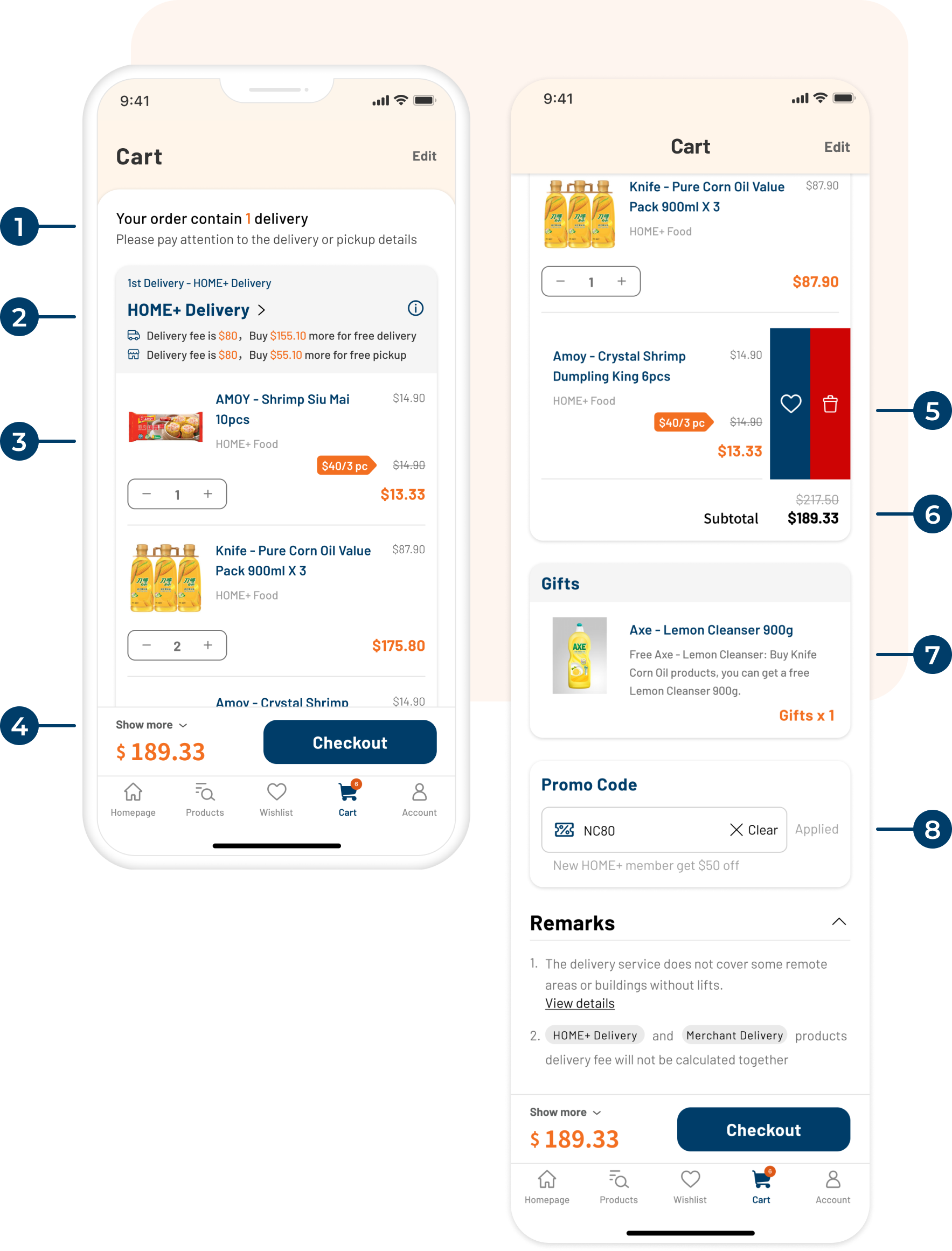
Checkout is where purchase intent meets the last set of reasons to leave. The redesign focused on removing those reasons: deliveries were grouped clearly so users could see what was coming when, the promo code section explained itself instead of just erroring, and the sticky summary meant users never lost sight of their total.
Revamped Design - Shopping Cart
As users may receive multiple deliveries for one order. This is a new description to indicate how many delivery for this order
The products in cart are grouped by delivery method. This info section is indicating the method, delivery fee and amount to meet free delivery
Redesigned product section. Users can adjust quantity directly and it’ll show the original price, discount applied and subtotal
Sticky bar for order summary and Checkout button
Gesture control for adding the product to Wishlist or deleting it
Subtotal amount for this delivery grouping

Section to show the free gift included in this order

Added a description for the promo code section to indicate the offers or error message
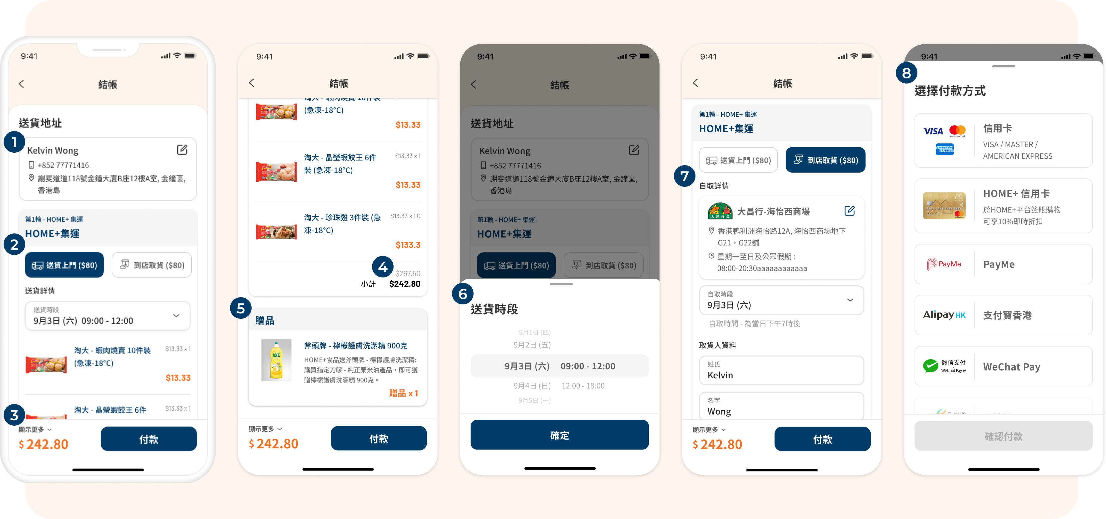
Revamped Design - Checkout
Delivery address selector, users can add a new address or select other address
Delivery method options. For HOME+ consolidate delivery, users can select delivery to home or pick up in store
Sticky bar for order summary and Pay button
Subtotal amount for this delivery grouping
Section to show the free gift included in this order
Delivery time selection bottom sheet
Store selection and pick up details
Payment selection. It will be shown when user clicked Pay button and proceed
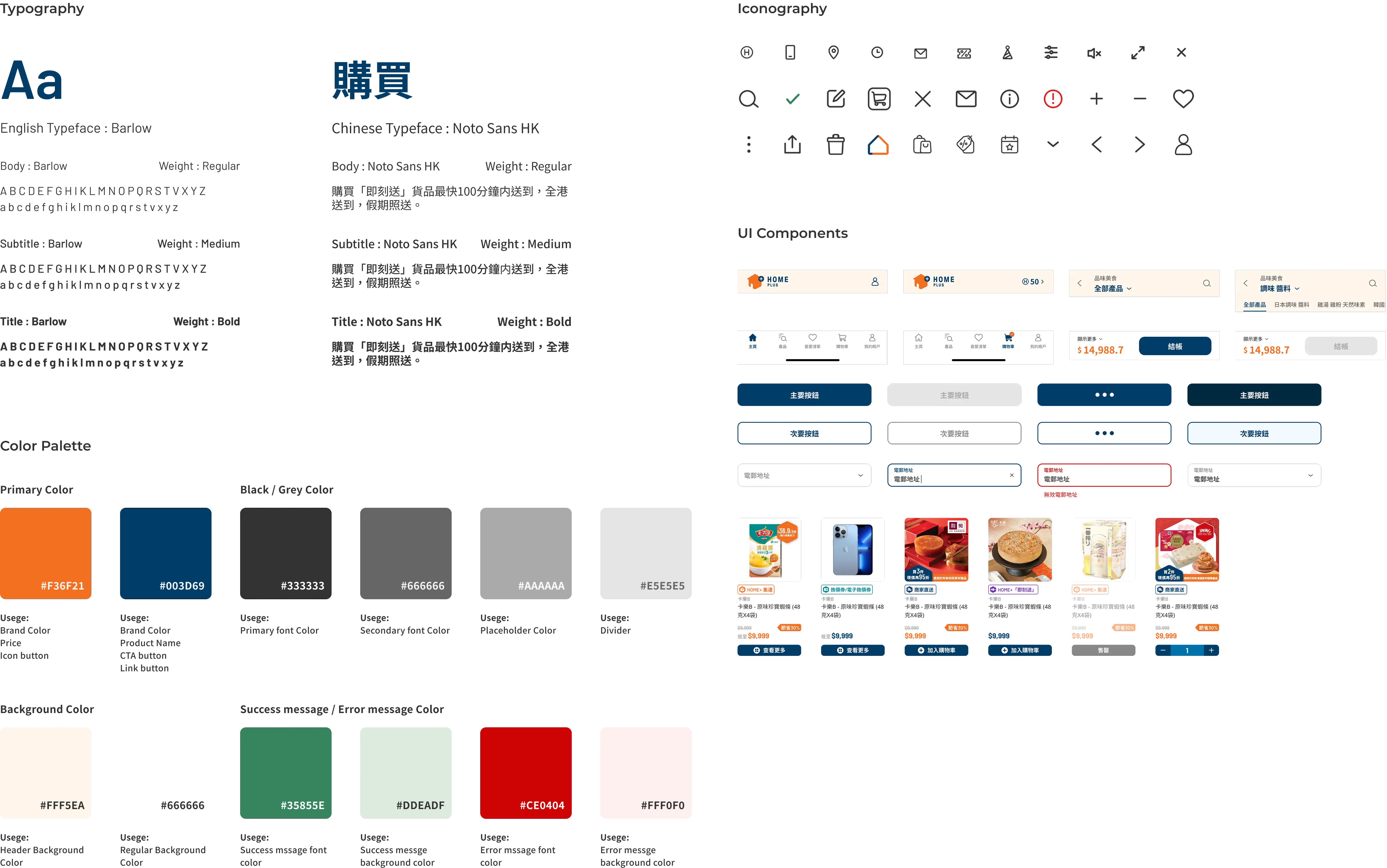
HOME+ had no existing design system, which meant we were building from scratch and a constraint that was also an opportunity to do it right.
The system was built on three principles: mobile-first, atomic design, and flexibility over rigidity. Mobile-first was straightforward given the app context. Atomic design kept the library scalable, building from tokens and base components up, rather than designing one-off screens and extracting components after the fact.
Flexibility over rigidity was the most deliberate choice. The design system wasn't scoped just for the app, the goal was for it to extend to HOME+'s responsive website as well. That meant components needed to hold up across different screen sizes and contexts from the start. A rigid, app-only system would have created more work down the line and risked inconsistency across platforms. Building with flexibility baked in gave the team a single source of truth for both.


