From Research to Roadmap: HOME+ Promotional Wallet
HKBN | Mobile App | E-Commerce
This project started with a question rather than a brief: The promotional experience in HOME+ existed, but nobody was sure if it was actually working for users or just sitting in the background. I used a mix of behavioural data, survey feedback, and competitor review to find out, and the answer was pretty clear.
The research pointed toward a dedicated promotional wallet but the feature touched too many parts of the shopping journey to ship all at once. I used the findings to define a phased MVP that started with the highest-value touchpoints and built toward the broader vision incrementally.
Company
Hong Kong Broadband Network - HOME+
Tools
Figma,
FigJam,
Google Analytics,
SurveyMonkey
Roles
Research & Problem Framing,
Feature Strategy,
Cross-functional collaboration,
MVP planning
Deliverables
Research Findings,
Design Solutions,
MVP Roadmap,
Prototype
My Role
I led the research and feature-definition work for this initiative, using user insights and business context to shape a practical direction for the promotional wallet experience.
Research & problem framing
Identified friction points through behavior analysis, survey findings, and user feedback.
Feature strategy
Defined the opportunity areas that shaped the promotional wallet direction.
Cross-functional collaboration
Aligned with stakeholders on priorities, constraints, and product direction.
MVP planning
Helped break the broader feature vision into a phased rollout plan.
Promotions played an important role in the HOME+ shopping experience, but the journey around finding and using them was fragmented. Users were already motivated by discounts and special offers, yet the product did not make those benefits easy to discover, understand, or apply at the right moment.
The gap between those two things: Users actively wanting promotions, and The product making them hard to use was a meaningful business problem. Promotional campaigns were already running; the value just wasn't reaching users at the moments it could influence a purchase decision. That's a fixable problem, and fixing it had a direct commercial case.
To evaluate the promotional journey, I used a mix of research methods:
Behavioral analysis to identify where users were engaging with promotions and where friction appeared.
1
User feedback to understand how customers perceived existing offers and what made them difficult to use.
2
Competitor review to compare how other platforms surfaced, organized, and applied promotions.
3
The research pulled from three sources: Internal platform data, A survey of 80 customers, and Competitor review of local and overseas platforms. Together they pointed to the same problem from different directions.
The platform data showed that over 70% of orders used coupon codes, meaning promotions were already driving purchases. But 33% of those orders triggered an error in the coupon field. The survey confirmed users felt it: a 4/10 ease-of-use score, and 92% saying they couldn't apply a code without double-checking or copying it from somewhere else. The competitor review showed why. Most local platforms assigned coupons to users but had no smooth redemption path, while overseas platforms like Taobao and Amazon let users select and apply offers directly without typing a code at all.
The conclusion was the same regardless of which source you looked at: The promotional value was there, users wanted it, and the product was getting in the way at the moment it mattered most.
What We Learned From Users
70%
of users checked available offers before checkout.
60%
of users had applied a coupon code before.
92%
of users wanted to see promotion details more clearly during the shopping journey.
33%
Average 33% orders triggered an error case in coupon code field
What We Learned From Competitors
I looked at six local platforms and four overseas. The key difference: overseas platforms (Taobao, JD, Amazon) let users select and apply coupons directly, no code input required. Local platforms mostly assigned coupons proactively but dropped the ball at the redemption step. That gap between a coupon existing and a user successfully using it was exactly the problem our data was showing too.
Local Platforms Pros and Cons

Proactive to provide consumption decoy
Pertinence different customer groups
In line with the mentality of local consumers

Limitation of coupons number
No suitable coupon direct case drop-off
Oversea Platforms Pros and Cons
Diversity of coupons
The rewards section is more expandable
Find suitable coupons with user own requirement
Users need to digest and explore more flow
Too much selection cause the opposite effect
The research made it clear that the problem was not the value of promotions themselves, but the way they were surfaced and used across the shopping journey. Rather than treating discounts as disconnected campaigns, I defined a more structured promotional wallet concept that could give users a clearer and more consistent way to discover, manage, and redeem offers.
The direction organised around three things: Discoverability (promotions needed a home users could find), Redemption friction (applying an offer at checkout was harder than it should be), and Contextual visibility (promotions should appear where users are already making purchase decisions, not just in a separate wallet). Those three areas became the foundation for scoping the MVP.
Improve Discoverability
Make promotions easier to find and review in one place.
1
Reduce redemption friction
Help users apply offers with less effort and less guesswork.
2
Support timely visibility
Surface relevant promotions at key moments in the shopping journey.
3
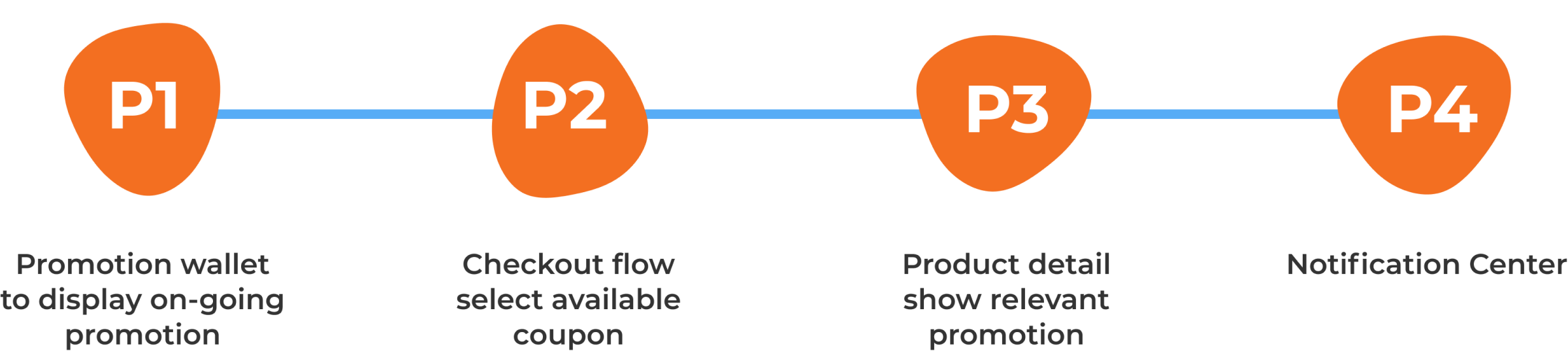
The full wallet concept: Wallet foundation, Checkout integration, Product detail visibility, Notification centre was too broad to ship at once. I worked with the team to sequence it: start with the wallet itself and the checkout coupon flow, where the research showed the biggest drop-off, and phase the rest in as those touchpoints stabilised.
Phases 1 and 2 covered the highest-urgency problems the research identified. Users not knowing what offers were available, and not being able to apply them at checkout. Phases 3 and 4 extended the feature into the moments users were already making product and purchase decisions. Each phase was designed to work independently, so the team could ship and learn without waiting for the full feature to be complete.
To illustrate how the MVP direction could take shape in the product, I developed a set of key solution touchpoints across the shopping journey.
Here's how the three directions from the research translated into actual product touchpoints across the four phases.
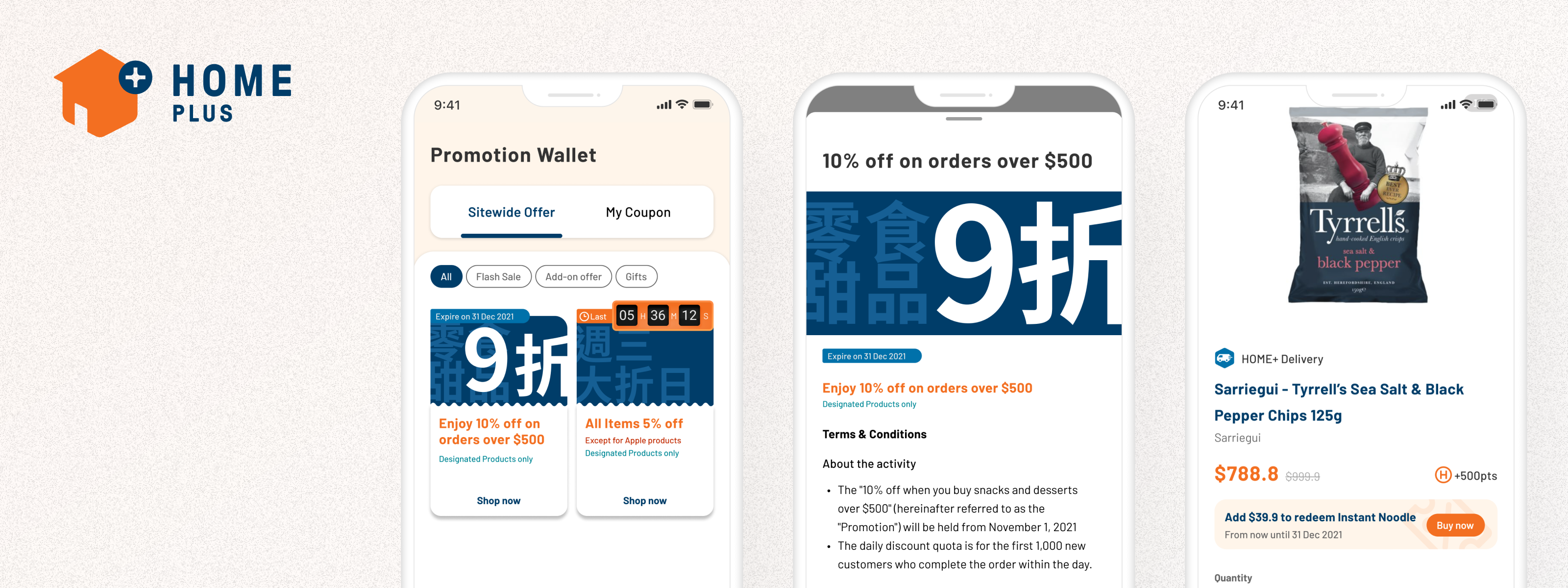
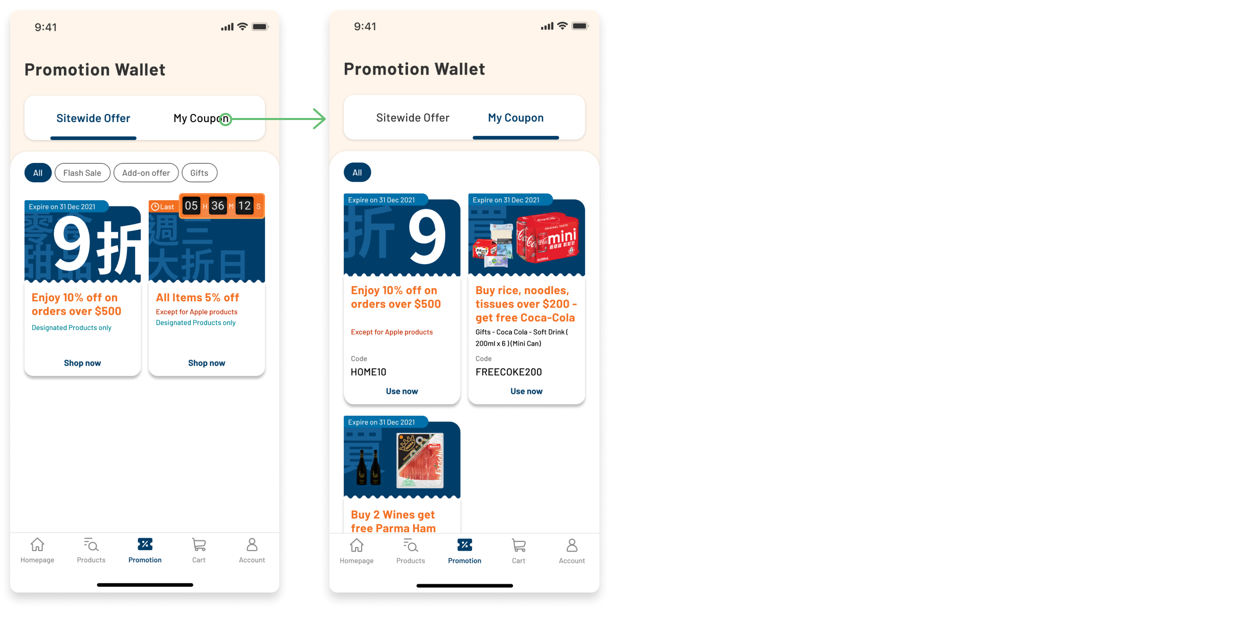
Promotional wallet foundation
The wallet gave promotions a permanent home in the app, a single place to see all available offers, organised by type. The "Sitewide Offer" and "My Coupon" tabs separated passive offers from redeemable codes, which addressed the confusion users described around not knowing which promotions applied to them and which required action.
Land on Available Product List
Sitewide Offer and My Coupon
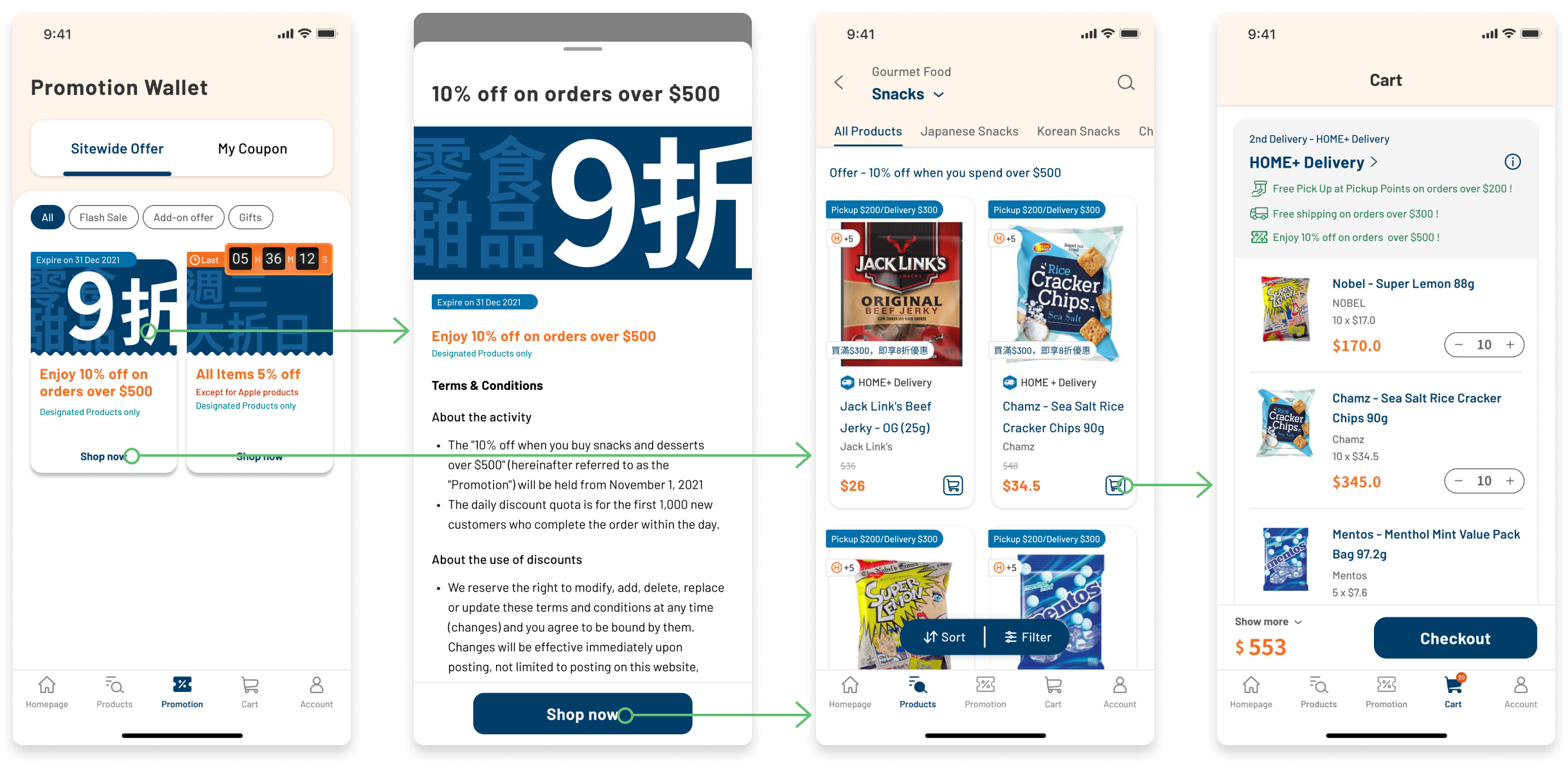
Promotion use at checkout
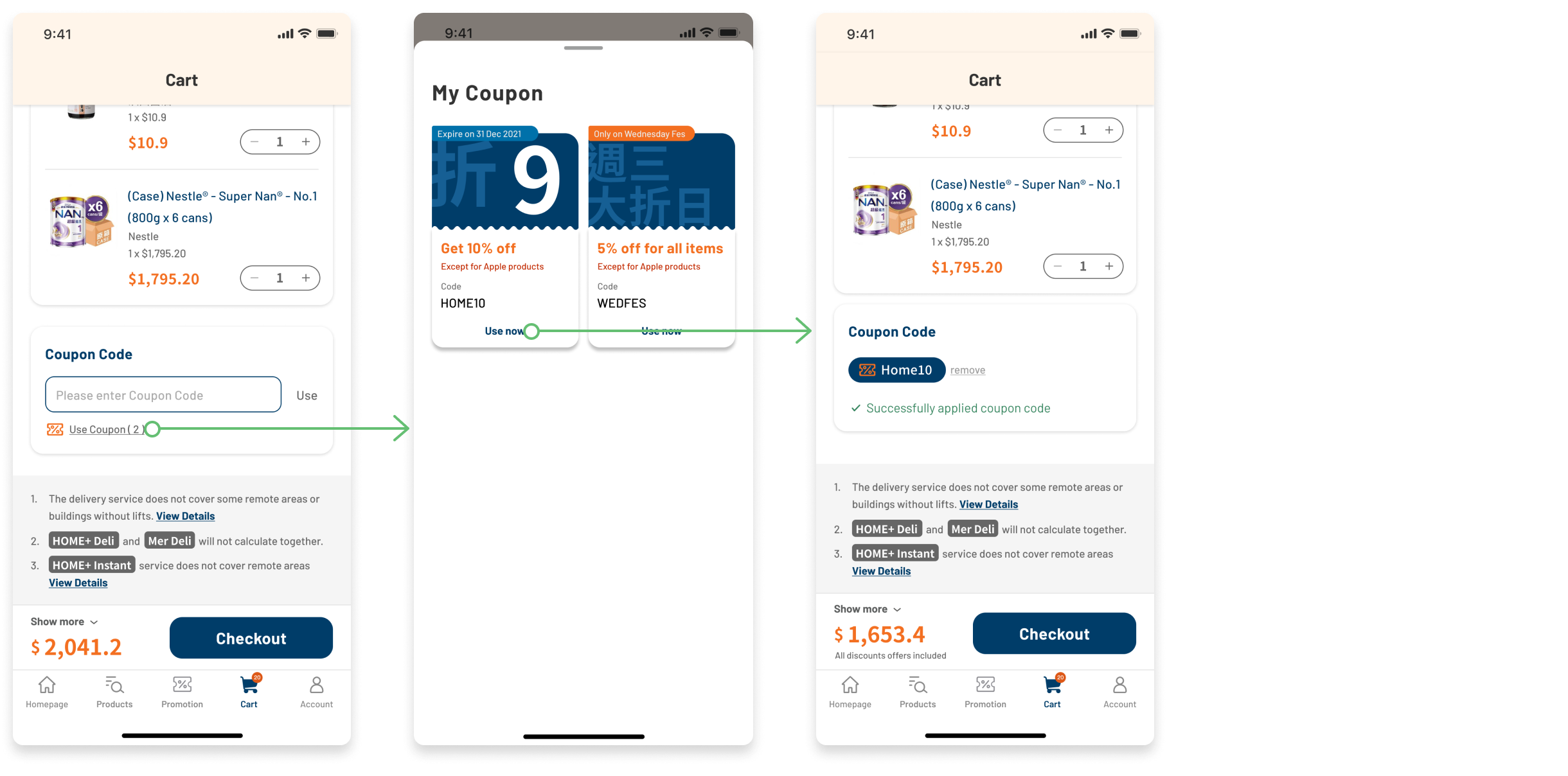
Phase 2 brought promotions into the cart and checkout flow directly. Rather than expecting users to remember a coupon code from the wallet, the redesign surfaced applicable offers at the moment of purchase: Visible, Selectable, and Confirmed before payment. This is where 60% of users were failing before, and the most direct fix to that drop-off.
Apply coupon in cart
Contextual promotion visibility
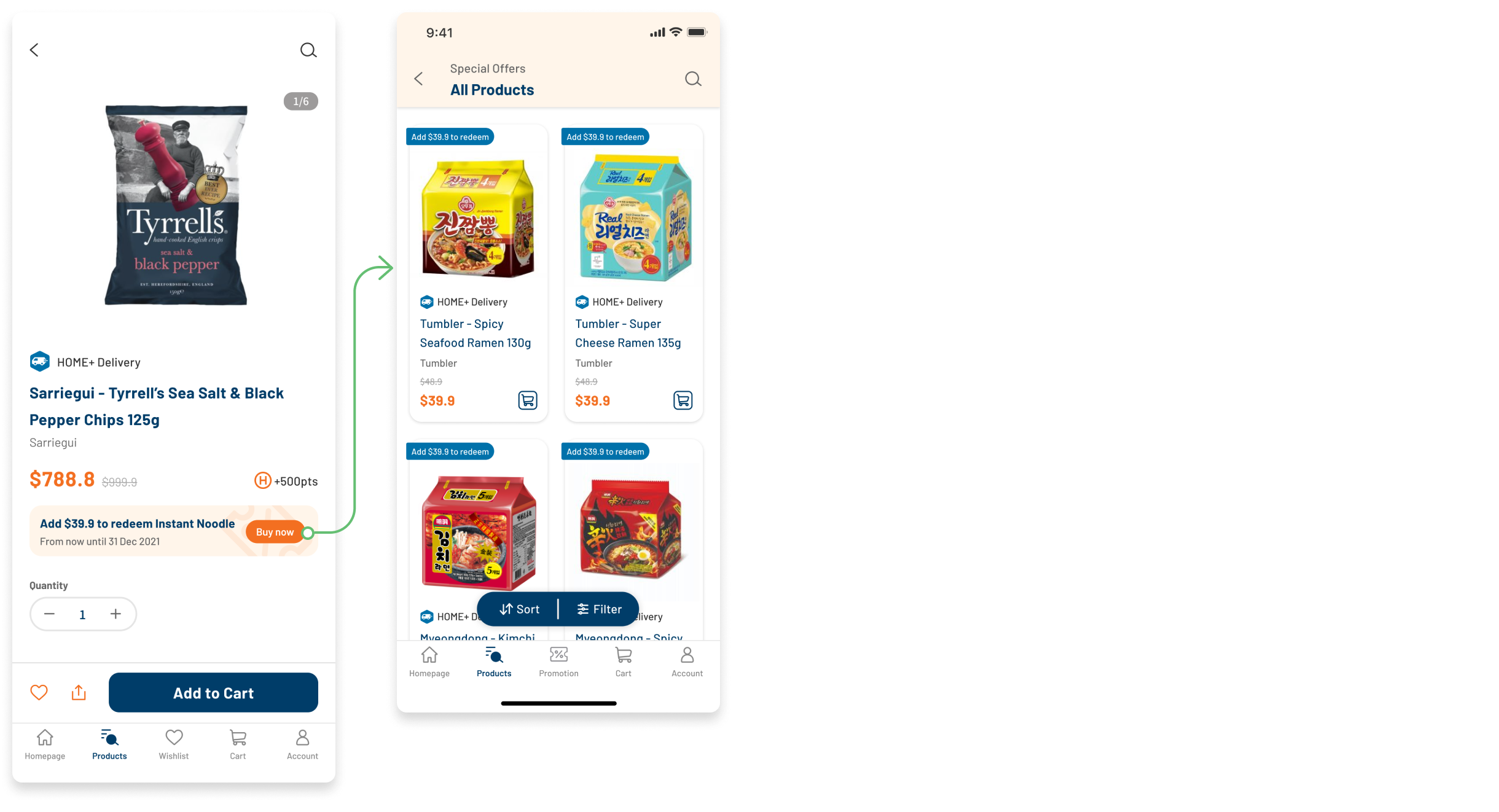
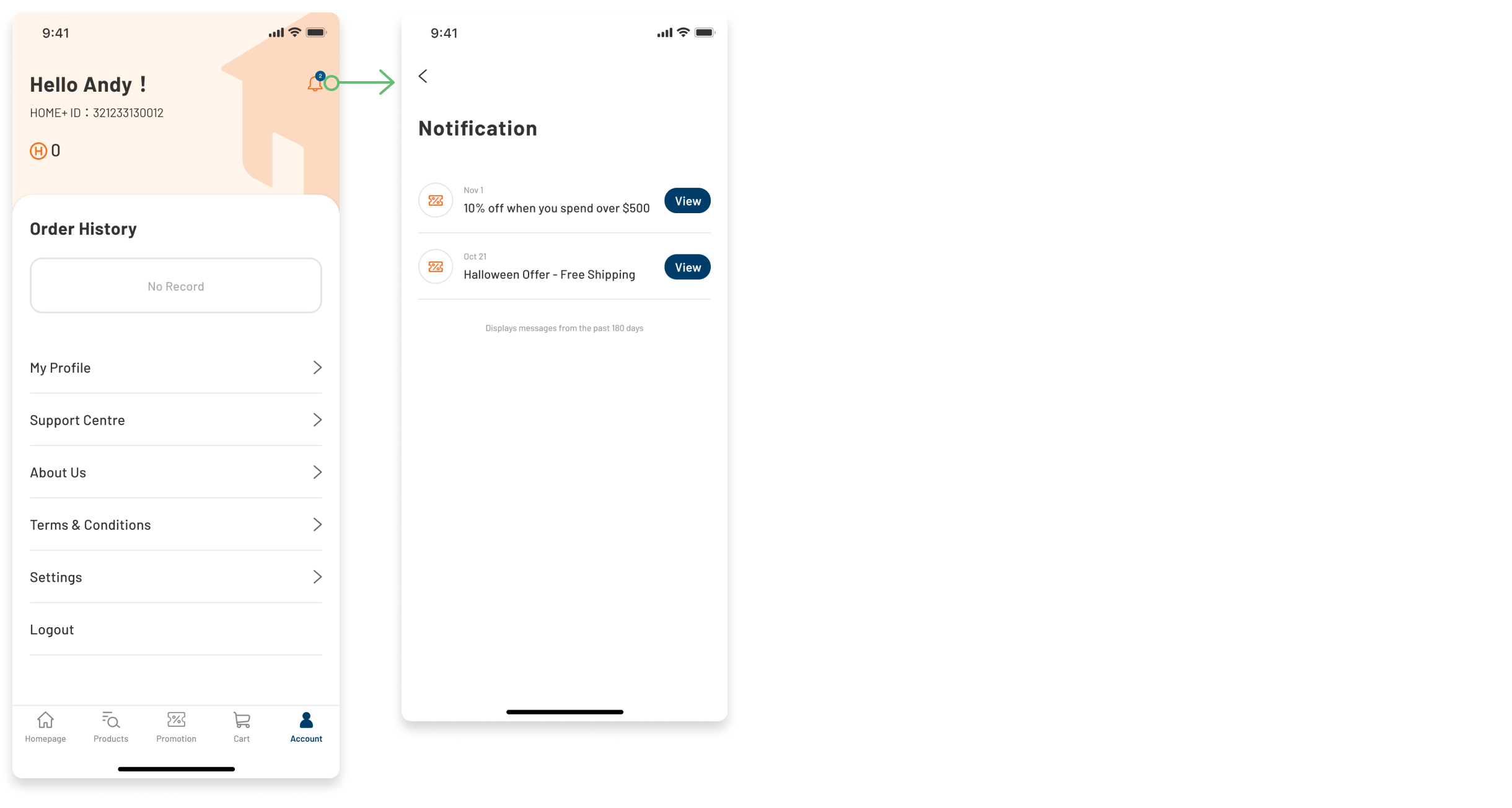
Phases 3 and 4 moved promotions out of the wallet and into the shopping journey itself. Relevant offers appear on product detail pages before users add to cart, and the notification centre surfaces time-sensitive promotions at the right moment. The goal was to make promotions feel like a natural part of how users shop, not a separate feature they have to remember to check.
Special promotion in Product Details
Notification center
Outcome
Following the launch of Phase 2, the updated promotional experience contributed to a 28% increase in app-driven sales. The phased approach meant the team was able to ship and measure early without waiting for the full feature, and the Phase 2 results made the case for continuing with Phases 3 and 4.
Reflection
The most useful thing this project did was give the team a shared language for the problem. Before the research, there was a vague sense that the promotional experience wasn't working but no clear picture of where it was breaking down or why. Having the data and the user feedback in one place made it easier to align on scope, sequence the MVP, and explain the prioritisation to stakeholders who had their own views on what the wallet should do first. Research as alignment tool not just discovery tool, that was the real output.