Insurance Operations Platform
Studio C&G Inc. | Desktop App | B2B Operation
A Canada-based commercial insurance provider was running their daily operations across four teams — Claims (A&S and P&C), Finance, and Underwriting on a single internal platform. It was the system everyone depended on, and it was making their jobs harder than it needed to be. Users were manually cross-checking documents, hunting for task statuses across fragmented screens, and working around a structure that didn't reflect how they actually operated. Every small inefficiency, multiplied across four teams and hundreds of daily tasks, was adding up to real lost time and friction.
I led this project end-to-end, from conducting the user interviews and facilitating the How Might We workshop, through to final UI and design specifications. Focused on identifying which workflows caused the most pain and redesigning them in a way that matched how the teams actually worked. The redesign reduced task completion time by 25% and task error rate by 36%.
Company
Canada-based Commercial Insurance Provider
Tools
Figma,
FigJam,
Figma Make,
AI Tools
Roles
End-to-End UX Design,
UX Research & Strategy,
Workshop Facilitation
Deliverables
Workflow Mapping,
Workshop Findings,
User Journey Maps,
High-Fidelity UI Specs, Prototype
Client name and branding have been anonymised in accordance with a non-disclosure agreement. All work shown reflects my own design contributions.
Users Interview
To uncover pain points across the four teams and build a foundation for the redesign, I planned and conducted 8 user interviews (2 users from each team) independently and used AI tool to synthesize hours of recordings into the following clear, actionable insights.
Insights from the interview:
Users relied heavily on manual workarounds because critical information was scattered across the platform.
Different teams followed different workflows, which made consistency and onboarding difficult.
Important actions and status changes were not always easy to find, increasing effort and risk of error.
New users faced a steep learning curve due to system complexity and unclear task pathways.
How Might We? Workshop
After the interviews, I ran a How Might We workshop with the product team and stakeholders. Rather than walking them through a summary deck, I wanted us to look at the findings together so everyone left with the same read on the problem, not just my interpretation of it. It got us to agreement on priorities faster than I expected.
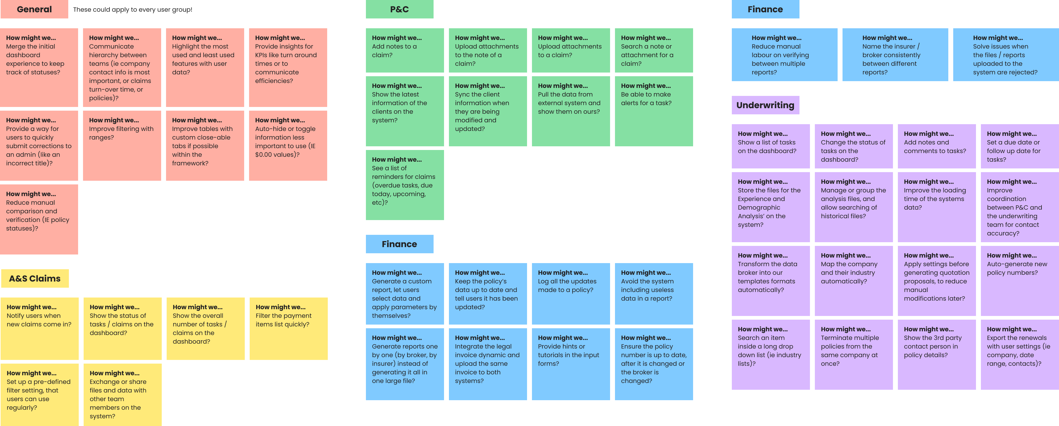
Insights from the workshop:
The workshop highlighted a shared need across all teams: centralization. Users wanted a unified dashboard to track statuses and KPIs. We found that fragmented notifications and file sharing were causing delays in claims workflows, while finance and underwriting needed cleaner data and more automation. That pattern pointed us toward a single priority, the redesign had to break down team silos and streamline how information flowed.
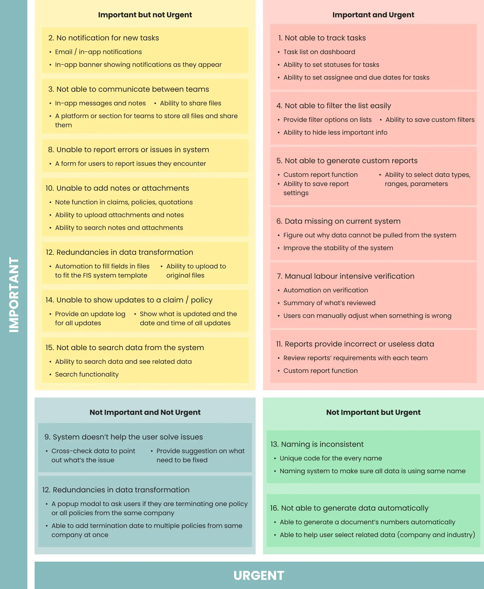
To improve the platform effectively, I first needed to identify which problems were creating the most operational friction across teams. Then I used a priority matrix to evaluate issues based on user impact and business value, then focused the redesign on the workflows that would most directly improve visibility, reduce errors, and support faster daily task completion.
Problem-Solution Mapping
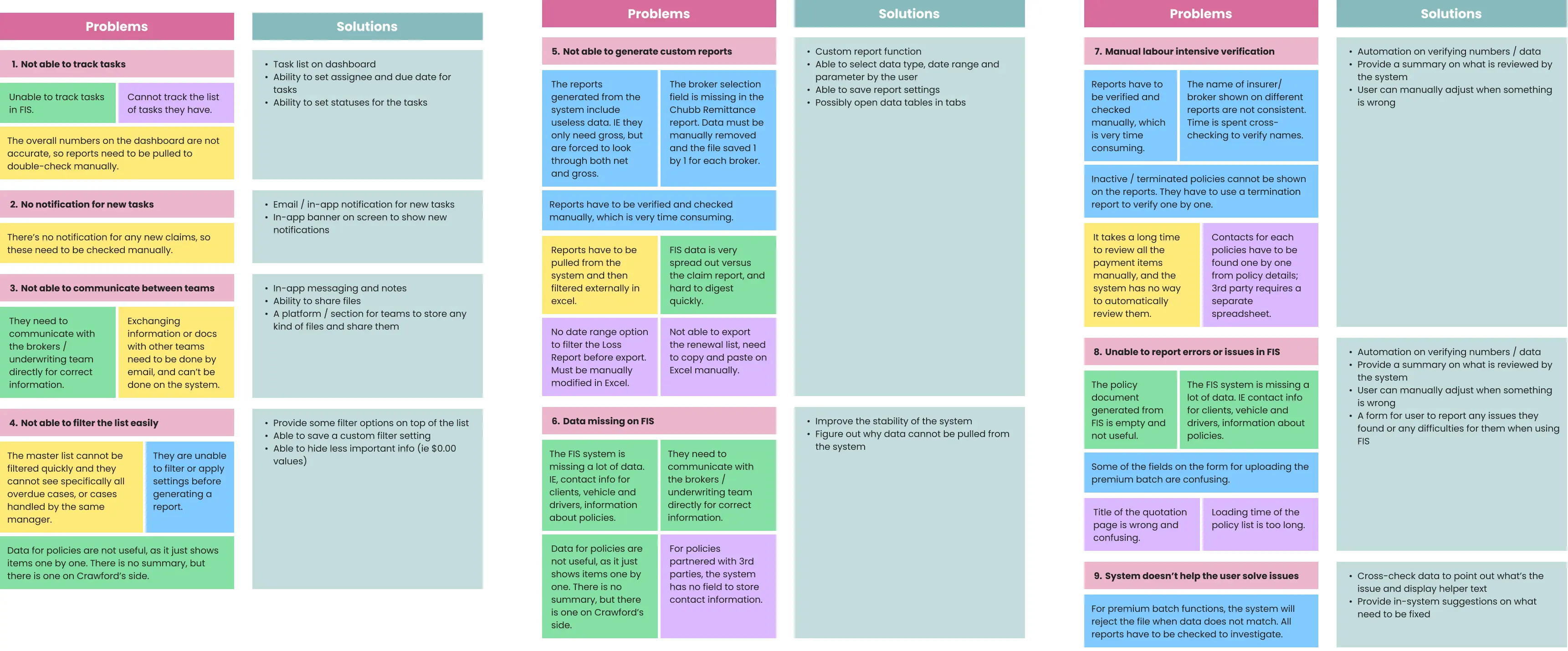
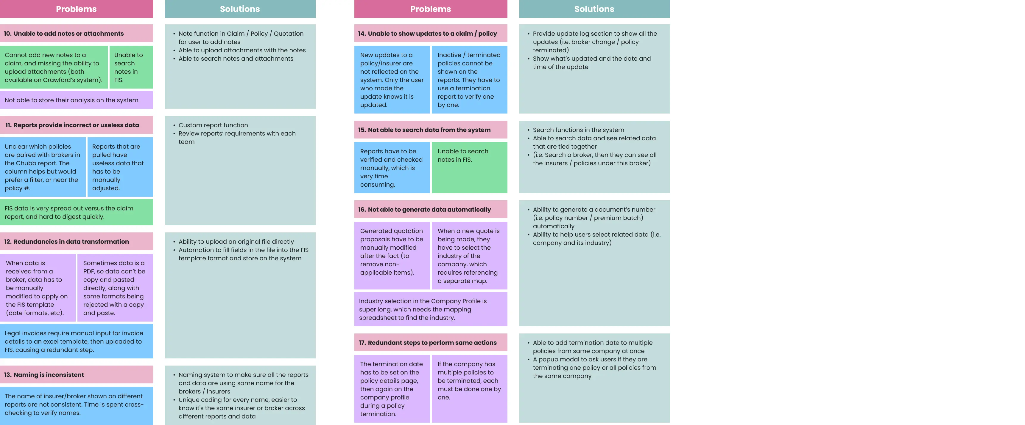
Priority Matrix
With a long backlog and a fixed timeline, I needed a way to cut through the noise. I ran a prioritization session using an impact-effort matrix. Not to rank every possible fix, but to get the team to agree on which problems were worth solving first.
Key Design Priorities:
Dashboard Clarity:
Enhanced dashboard allowing users to track tasks, number of cases, and the ability to access different frequently used features quickly.
Task Management & Tracking:
Enhanced task visibility with the ability to update statuses, assign owners, and manage due dates.
Notifications:
Integrated email and in-app alerts to ensure immediate awareness and faster response times for new tasks.
Claims-related Workflows:
Automate the intenvise manual verfication process, and a flexible reporting tool allowing users to define parameters for tailored insights.
Decision and Scope
Scope was always going to be a risk here. The backlog was long, and there was real pressure to solve everything at once. Using the workshop findings, I worked with product and engineering to cut it down: we'd focus on the four views that drove the most daily use: Dashboard, Task Management, Notifications, and Claims. Everything else got parked. It wasn't a perfect outcome for everyone, but it was the right call to ship something that actually worked.
With scope agreed, I started mapping flows to understand how the current structure moved users through the system. What I found wasn't surprising given the interviews, the most-used actions were buried two or three levels deep, and the navigation logic reflected how the system was built, not how any of the teams actually worked.
User flows and Sitemap
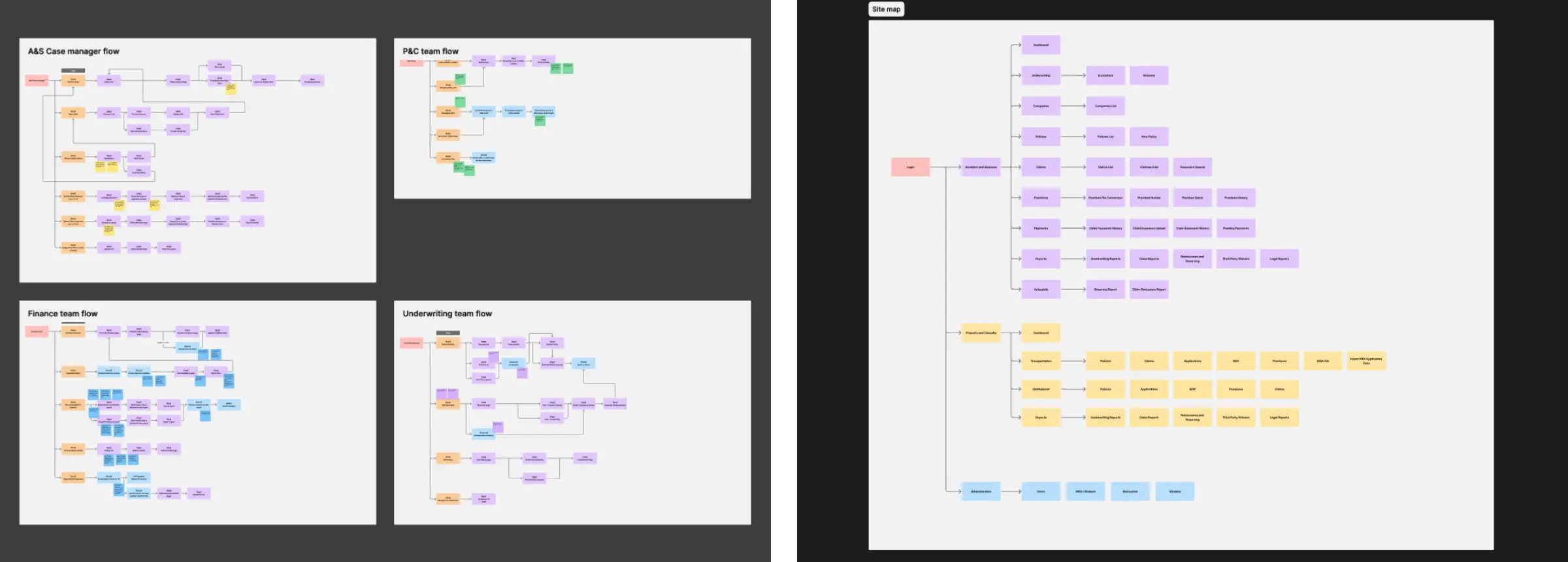
Why the structure changed
The old structure was organized around data types: Claims, Payments, Users, which makes sense as a database but not as a daily work tool. I restructured it around what people need to do each day: check status, take action, follow up. That shift meant fewer clicks to the most-used tasks, and less mental overhead figuring out where things lived.
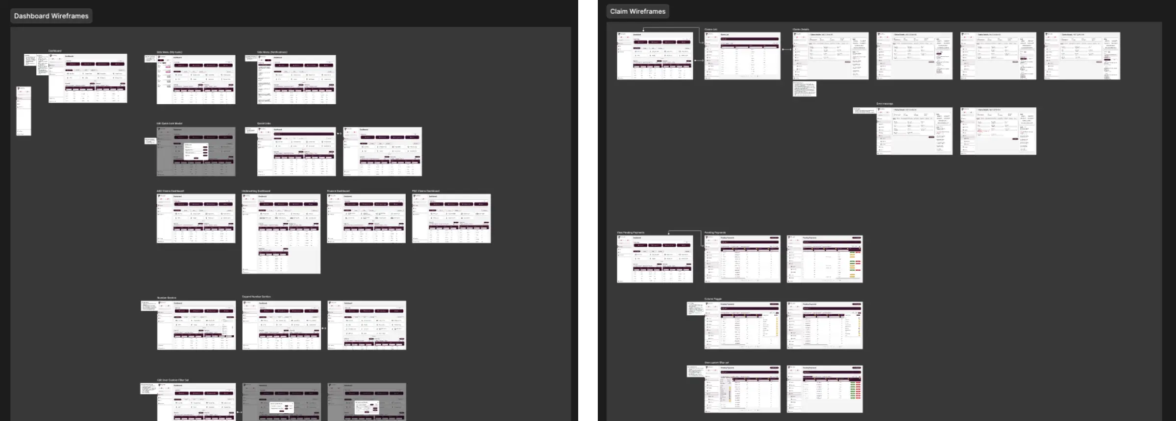
Once the flows were mapped, I moved into wireframes to figure out layout and hierarchy before touching visual design. I wanted to test structure first, where things lived on screen, how actions were grouped without the distraction of polish.
The final design was guided by a few core principles shaped by research, prioritization, and workflow analysis. Instead of redesigning screens in isolation, I focused on making the entire platform easier to scan, act within, and learn.
Tradeoff
One idea that kept coming up in research was intelligent automation — an AI layer that could flag issues and surface next actions without users having to hunt for them. The concept had real potential but building it would have consumed most of the project's capacity while leaving the most urgent day-to-day problems unresolved.
We focused the release on task tracking and a more functional dashboard instead. These weren't the flashiest features, but they were the ones that would immediately improve how all four teams worked every day. The AI-assisted layer became a clearly defined Phase 2.
The client's PM pushed for a simpler, lighter dashboard to reduce build cost. I disagreed as every team I interviewed mentioned not being able to see what needed their attention at a glance. We worked through the findings together and aligned on building it properly.
Principle 1 - Improve at a glance visibility
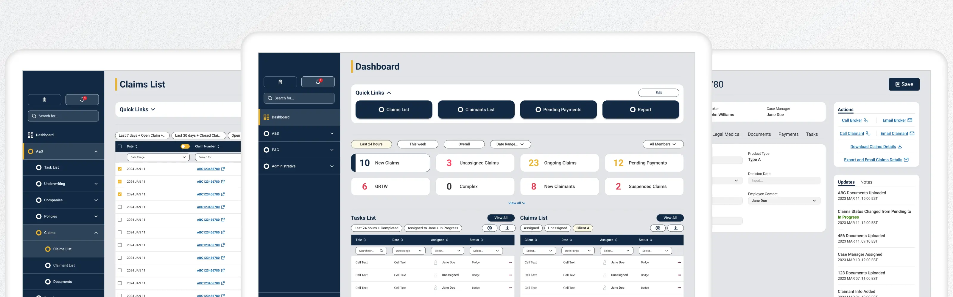
The dashboard and supporting views were redesigned to make key information easier to scan and understand quickly. Important metrics, task states, and alerts were surfaced more clearly so users could assess workload and identify priorities without digging through multiple sections.
Dashboard
.webp)
Side Menu: Added persistent action buttons with notification badges and a global search bar for finding cases instantly.
Quick Links: Introduced a customizable top section where users can pin their most-used tools.
KPI section: Redesigned to take up less vertical space while enlarging key metrics and adding robust data filtering.
Task list: Gave each user group a dedicated task list with built-in quick filters and download options.
Notifications
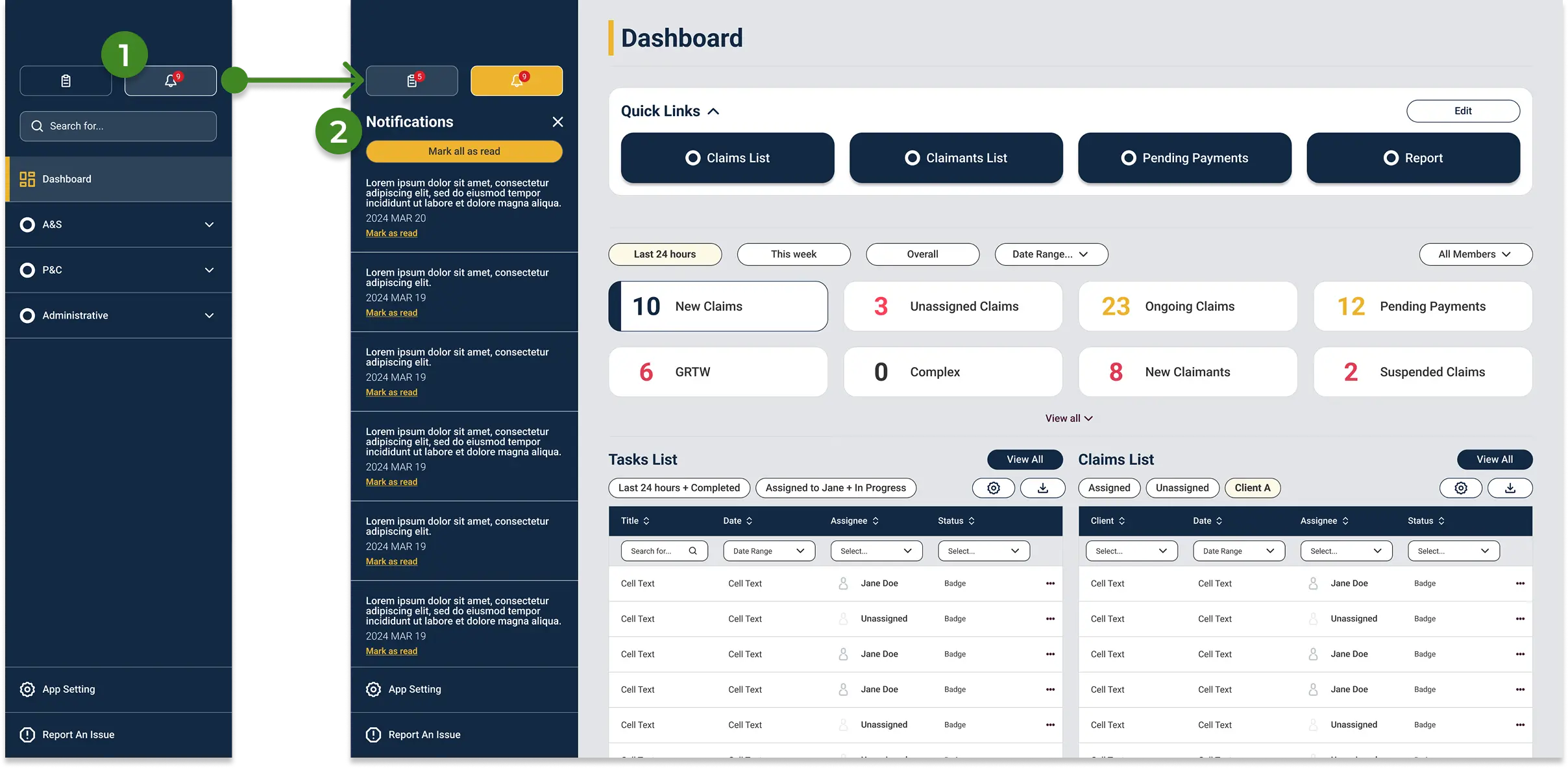
Access: Available directly from the side menu with a dynamic badge indicating unread alerts.
Alert Management: Users can dismiss alerts individually or use "mark all as read" to clear the queue and reset the notification counter.
Principle 2 - Reduce friction in high-frequency actions
Many daily actions in the original platform required extra effort because important controls and statuses were not easy to find. I simplified common workflows by improving hierarchy, making next steps more visible, and supporting faster execution in task-heavy areas such as task tracking, claims review, and bulk actions.
Task Tracking
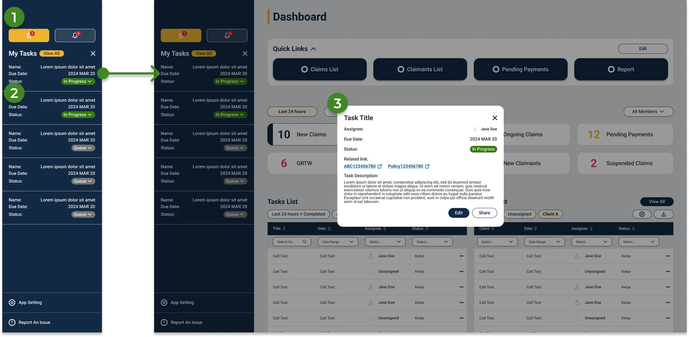
Quick Access: Opened directly from the side menu, complete with an active task count badge.
Task Overview: Displays assigned tasks with names, due dates, and statuses at a glance. Clicking "View All" opens the full list, while clicking a single task opens a detailed modal.
Task modal: Centralizes all necessary actions and automatically links related policies, brokers, and IDs to the task.
Bulk Actions in grid
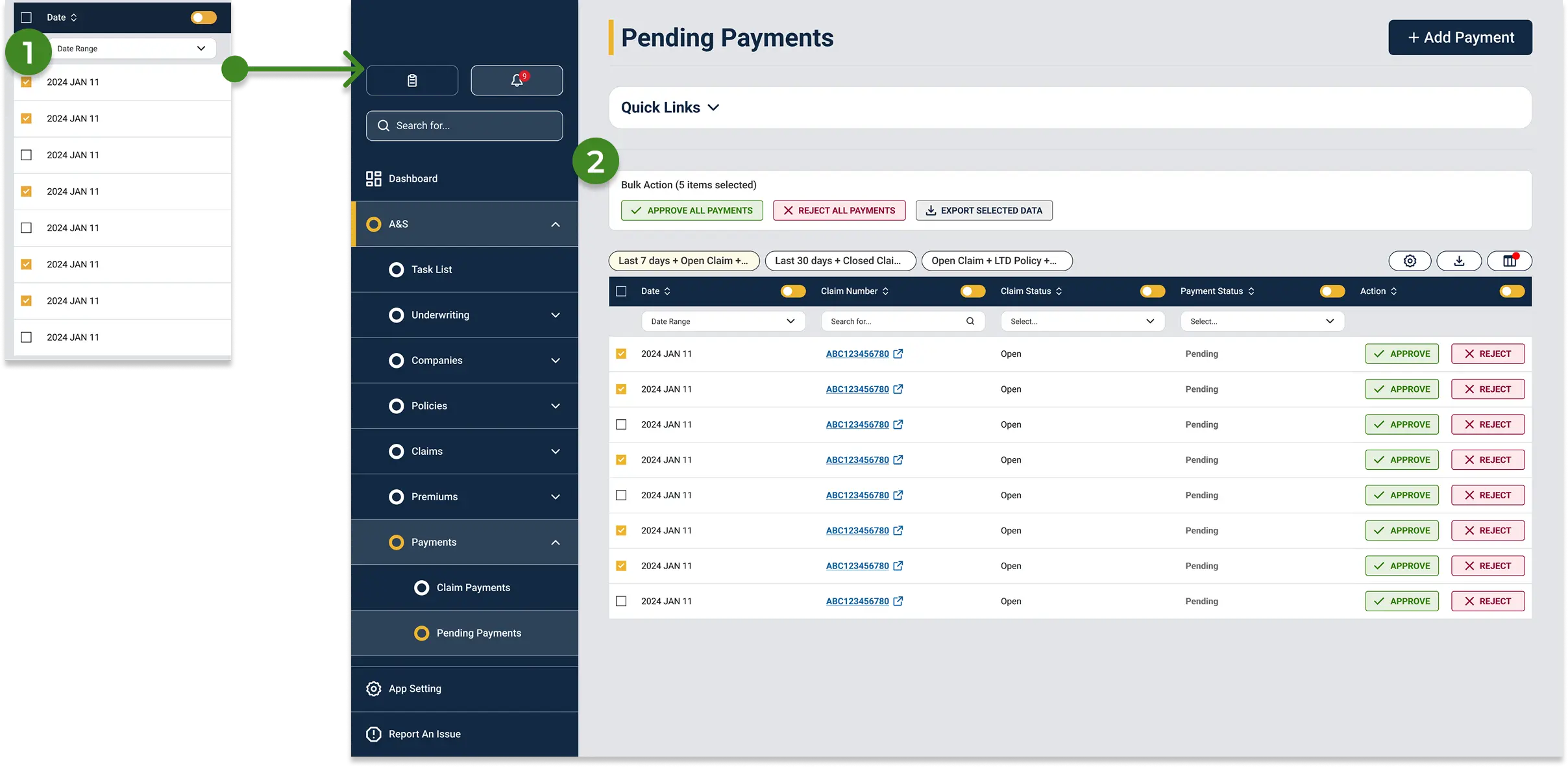
Multi-Select: Users can check specific rows to trigger batch operations.
Contextual Bulk Menu: A new section appears above the table upon selection, allowing users to mass-approve, reject, or export data with a single click.
Claims List
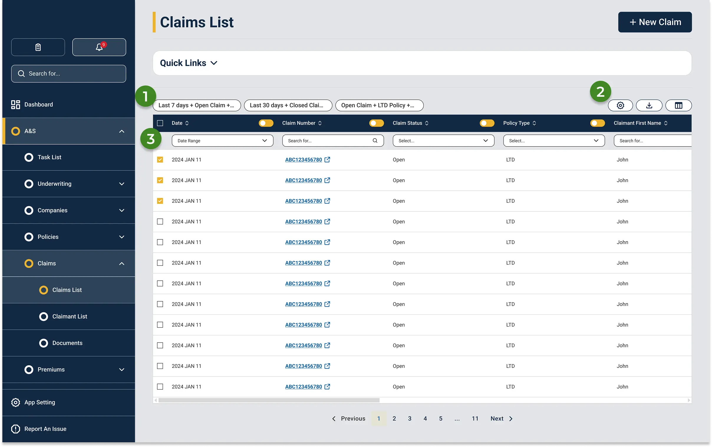
Custom Filter Sets: Users can save complex filter combinations and column layouts as presets, accessible instantly via a toggle.
Quick Tools: Right-side icons provide immediate access to edit filters, download custom reports, and toggle table columns.
Column-Level Filtering: Each column includes built-in search and checkbox filters. Users can locate items via free-text search or hide unneeded columns to reduce screen clutter.
Principle 3 - Support confident claim handling
Claims detail pages are the most information-heavy screens in the system, and there's no getting around that. The data is genuinely complex. The work here wasn't about reducing density, it was about grouping information the way handlers actually move through a claim, so the page felt navigable rather than like a wall of text.
Claims Details
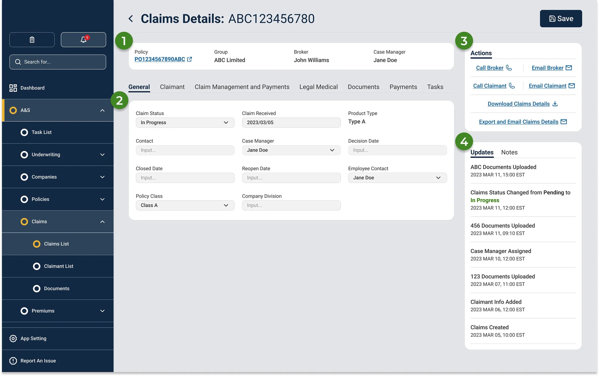
Info Bar: Highlights essential claim details and provides a direct link to the associated policy.
Tabbed Navigation: Replaces the exhausting single-page scroll of the old system by organizing dense content into clean, digestible tabs.
Actions Widget: Centralizes key contacts and next steps, eliminating the need to hunt across multiple pages to take action.
Updates & Notes: A dedicated widget logs all system changes. Users can easily add notes, upload files, and review the full attachment history in one place.
Testing
To evaluate the redesign, I conducted usability testing on the platform’s highest-priority workflows. Participants were asked to complete tasks related to reviewing claims, navigating between sections, managing task lists, and identifying pending actions, allowing me to assess whether the updated structure improved clarity, efficiency, and confidence during use.
Key Findings:
Participants were able to understand the overall structure of the platform more quickly, especially within the dashboard and task management areas.
Key actions were easier to locate, which reduced hesitation during common workflows.
The updated layout improved visibility of operational information and made dense screens easier to scan.
Some areas still required refinement, particularly where secondary actions and detailed information competed for attention.
Outcomes
Testing confirmed the direction was right. People moved through the platform more quickly, spent less time searching for actions, and asked fewer clarifying questions during tasks. There's still more to measure once it's live, but the usability results showed a real improvement in both speed and confidence across all four teams.
A few months after it's live, PM told us that their analystics data showed that the new platform reduced task completion time by 25% and task error rate by 36%.
Next Steps
There are still screens that need the same treatment, the more complex reporting and admin views that didn't make it into this scope. Reducing onboarding time was one of the original goals we couldn't properly test in a prototype, it needed to be reviewed as well.
This project reinforced how important clarity and prioritization are in workflow-heavy B2B products. Designing for multiple internal teams meant balancing density, speed, and usability without oversimplifying the operational reality. What I actually learned was how much of enterprise design is stakeholder work: negotiating scope, building shared understanding, and helping people see what the research is pointing to. The UI is almost the last part.