The research covered three angles: Current platform audit, Competitor review, and User survey data. Together they pointed to the same underlying issue: The platform was built around how the data was organised, not how a user actually thinks about their pension. Here's what I found from the research, and the specific direction I chose to address it.
Evaluating the current platform
Users Survey
3 / 10
3 / 10 is the scores of respondents rate the current platform
70%
70% of respondents said they had difficulties in using current platform
46%
46% of respondents said they were able to complete what they came to.
2 / 10
2 / 10 is the scores of respondents think if they will recommend this platform to others
Key Insights and Solutions
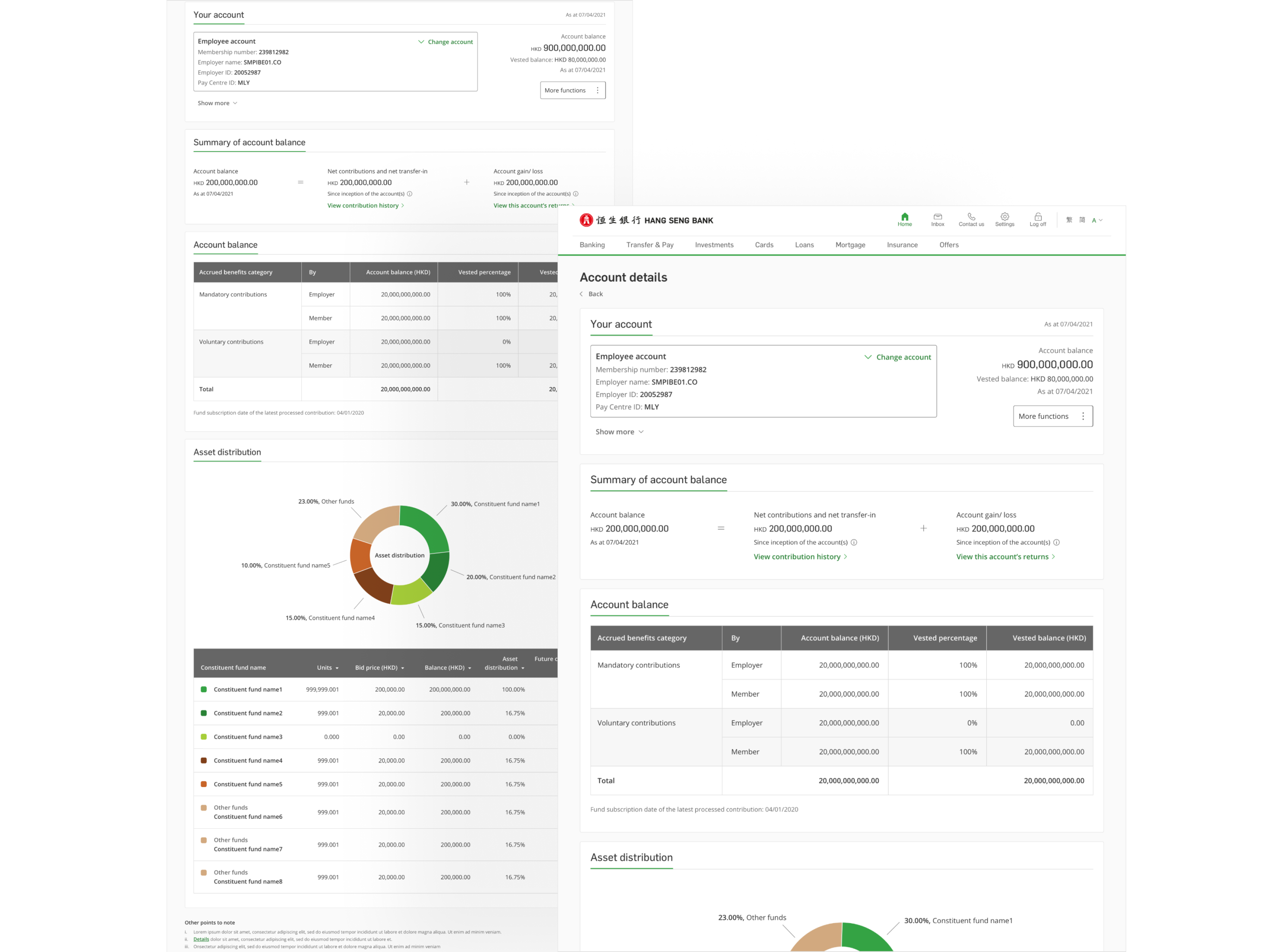
Users had no single view of their pension position.
Account balance, fund performance, and contribution history were all on separate pages with no single view that tied them together. Users who wanted to understand their pension position had to visit three or four places and do the mental arithmetic themselves, a significant ask for something people check infrequently and already find stressful.
Rather than fixing navigation or adding shortcuts, I decided the root problem was the overview page itself. The fix was structural: bring balance, performance, asset distribution, and contributions together at the top level, with detail available a click away.
High-stakes actions had no structure to support them
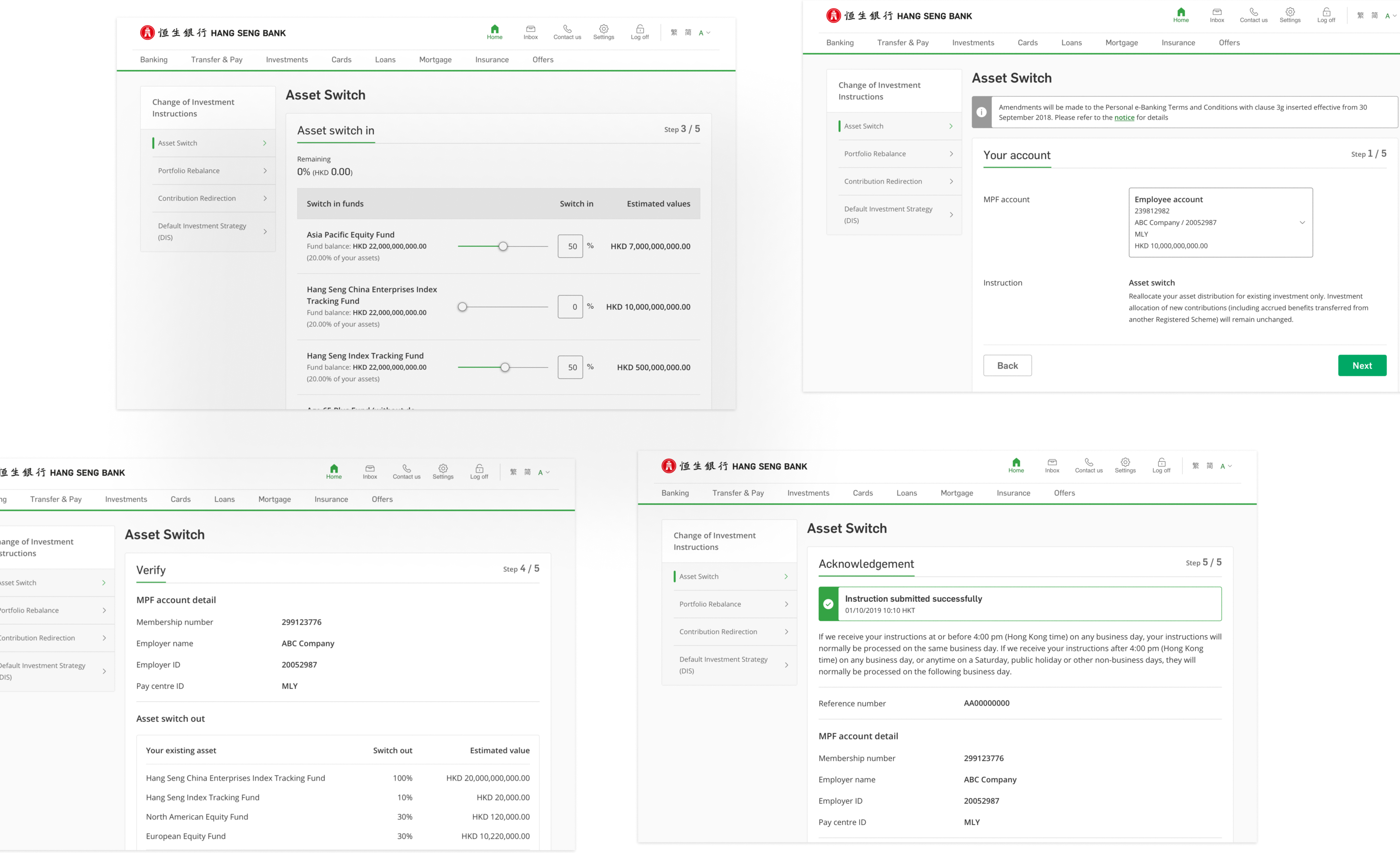
Changing investment instructions is a high-stakes action, it affects how a user's retirement savings are allocated. The existing flow treated it like a basic form fill, with no summary of what was changing and no confirmation of what had been submitted.
I prioritised rebuilding these flows with a clear stepped layout: select, review, confirm. Each step needed to show users exactly what they were changing before they committed for a decision with real financial consequences, that level of clarity isn't optional.
The platform needed to work for the returning user, not just first use
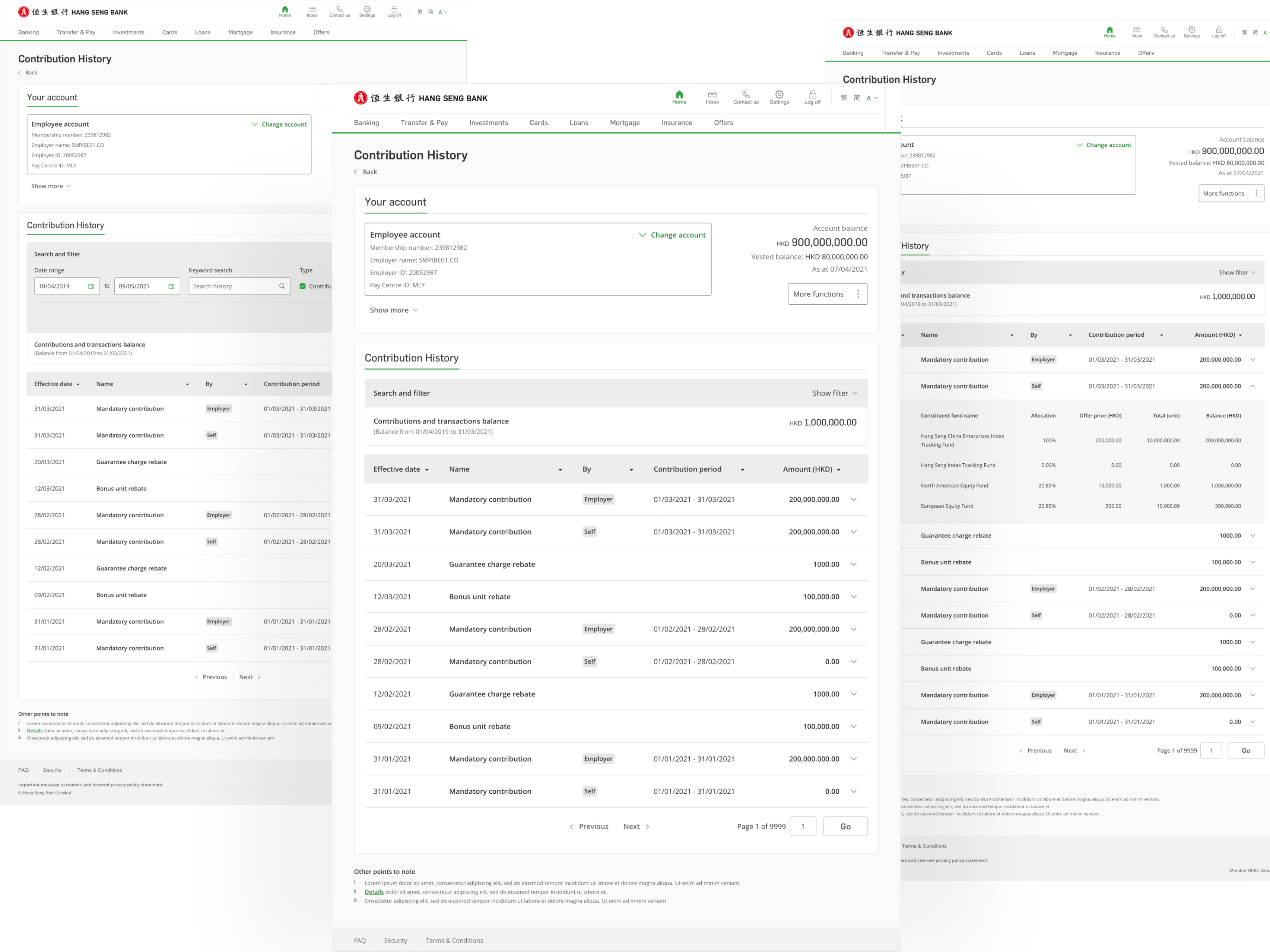
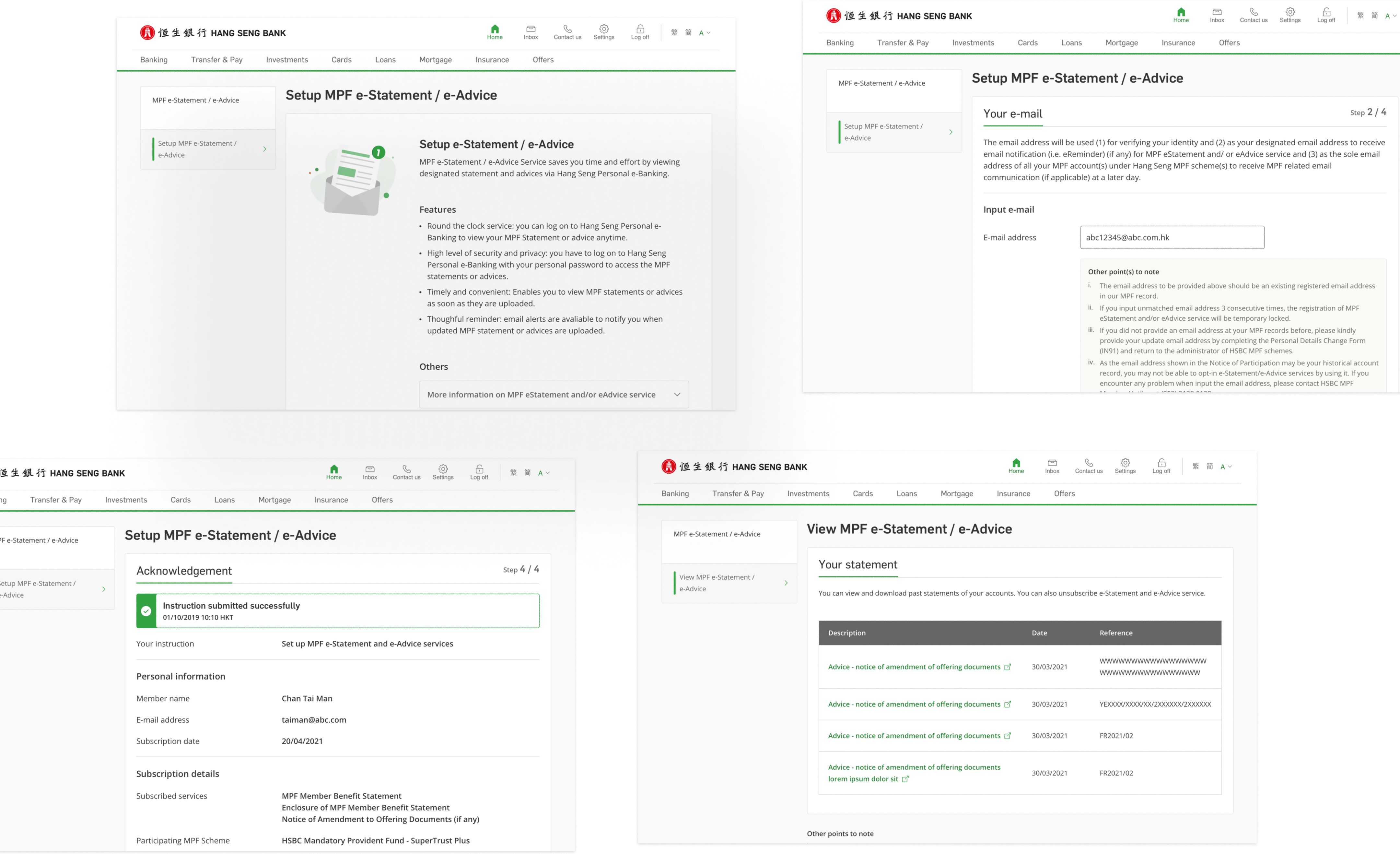
MPF isn't a product people use once and forget. Users come back to check statements, review returns, and track contributions across years. But the history and records sections were hard to navigate across visits. Inconsistent layouts, weak filter controls, no sense of continuity between screens.
I shaped the redesign around that repeat-use pattern: contribution history, e-statements, returns, and projections all needed consistent structure and reliable navigation, not just a visual tidy-up.
The final designs addressed the three priority areas directly. The account overview was restructured to bring the most important numbers together in one place. The key action flows were rebuilt with clearer step progression. And the history and records sections were reworked to support the way users actually return to and use the platform over time.
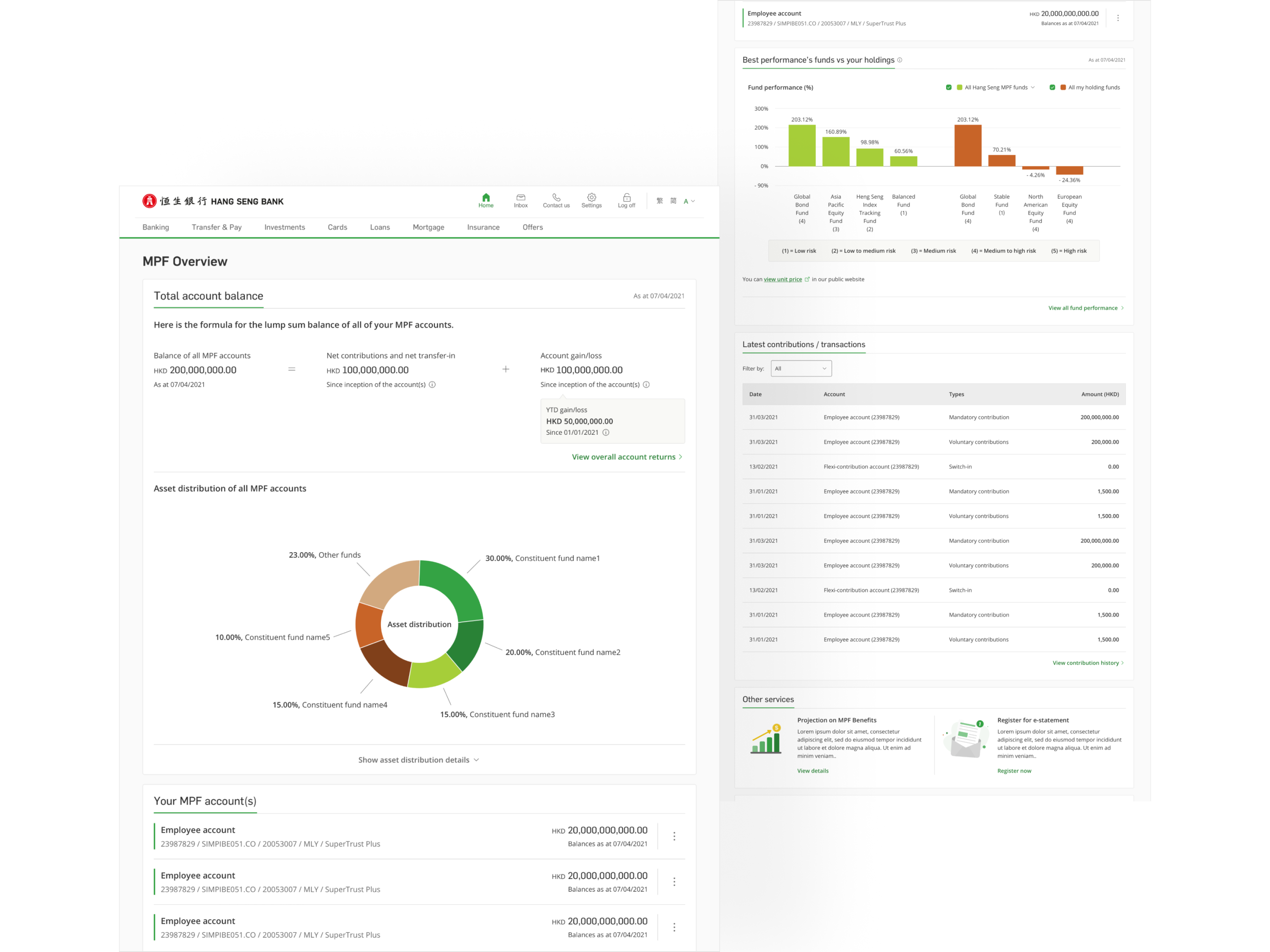
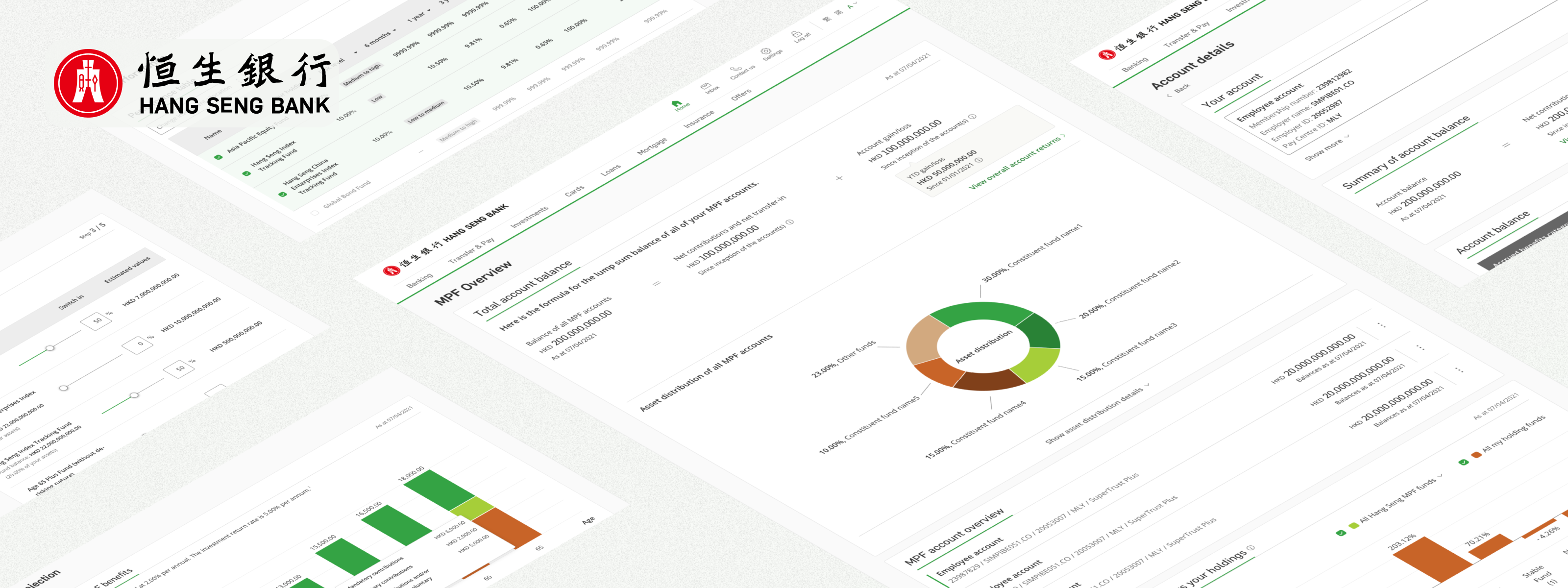
Account overview and performance visibility
The MPF Overview page was rebuilt around a single goal: let users understand their pension position without having to navigate away from the first screen they land on. Account balance, fund performance, asset distribution, and employer/employee contributions are all surfaced at the top level, with detailed breakdowns available a scroll or click away.
MPF Overview
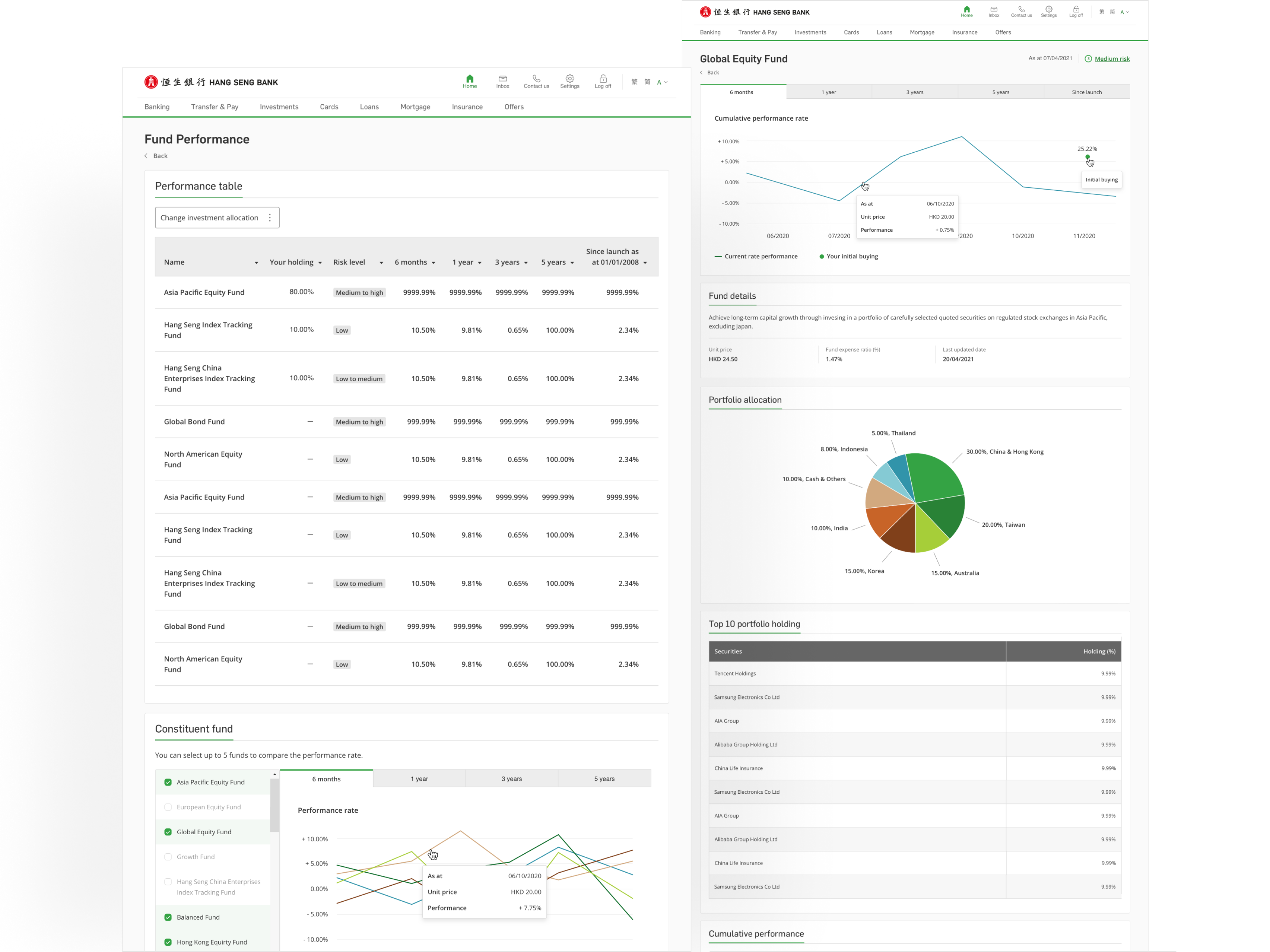
Fund Performance
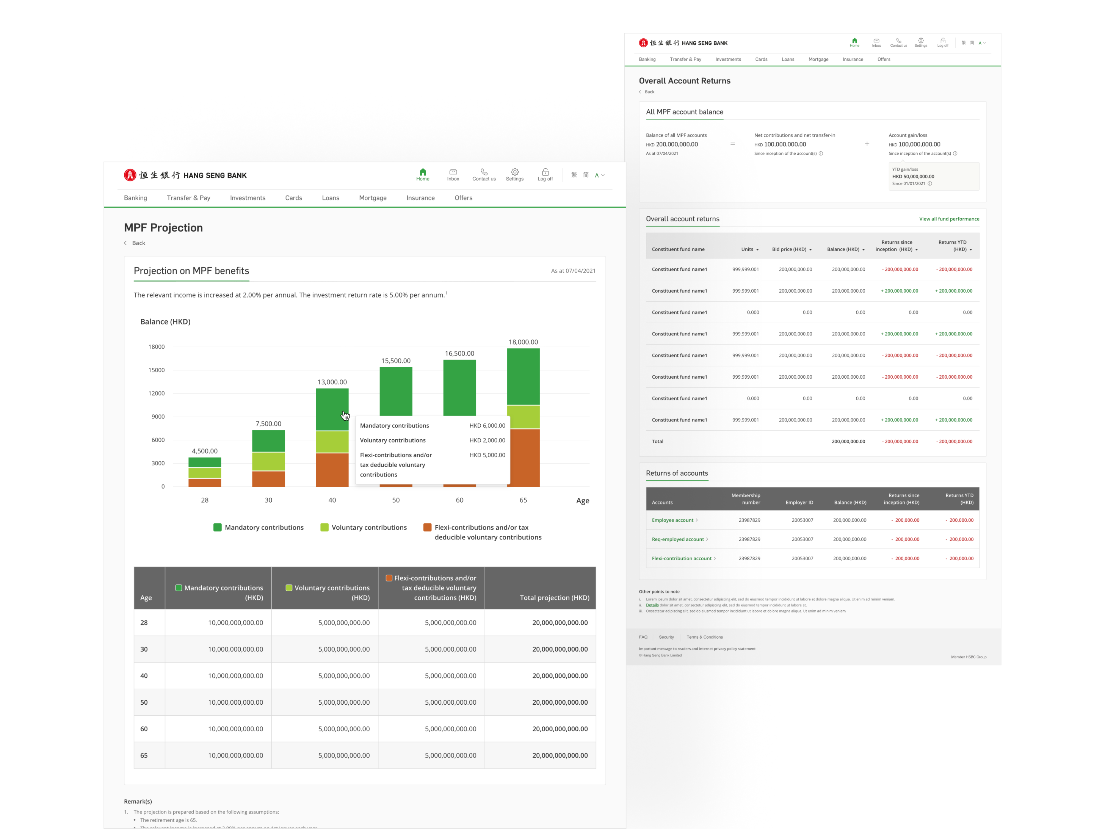
Account Returns and Projection
Investment instruction and account management flows
The investment instruction flow particularly Asset Switch was redesigned with a stepped layout that breaks the process into clear stages: select, review, confirm. Each step shows users exactly what they're changing and what the outcome will be before they commit. For a decision with real financial consequences, that level of clarity isn't optional.
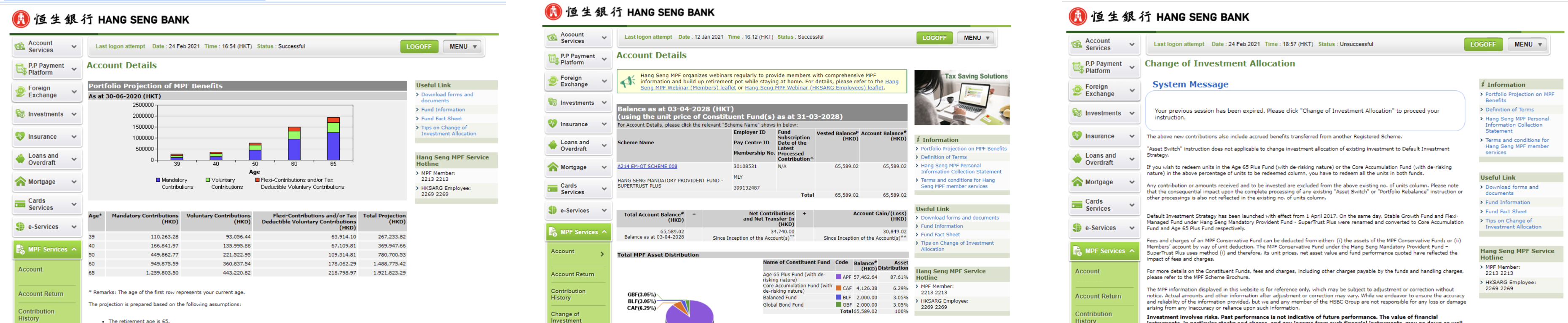
Change Investment Instructions
Account Details
History, records, and long-term self-service
Contribution history, e-statements, account returns, and projections were all present in the old platform but hard to navigate across. The redesign gave each section a cleaner table layout, better filter controls, and consistent structure so users can move between them without having to relearn the interface each time. These are the screens users come back for, they needed to work reliably, not just look tidy.
Contribution / Transaction History
MPF e-Statement / Advice