Logistics Management Platform
Studio C&G Inc. | Desktop | Logistics - Fuel Distribution
Project Overview
01
A fuel distribution company in British Columbia was running their operations across two separate tools. One handled dispatch, scheduling and field monitoring. The other managed client profiles, rates and invoicing, so the ops team spent a lot of time manually moving data between them and double-checking figures that should have been automatic.
I worked as the solo designer on a six-month project, working with their PM and dev team, to design a single platform that brought both worlds together. By the end, the two legacy tools were retired, the manual data transfers were gone, and the team had live driver tracking and a proper operations dashboard for the first time.
I worked as the solo designer on a six-month project, working with their PM and dev team, to design a single platform that brought both worlds together. By the end, the two legacy tools were retired, the manual data transfers were gone, and the team had live driver tracking and a proper operations dashboard for the first time.
Company
Fuel Distribution company based in British Columbia
Tools
Figma,
FigJam
FigJam
Roles
End-to-End UX Design,
UX Research & Strategy
UX Research & Strategy
Scope
Operations, fleet tracking, client billing
Client name and branding have been anonymised in accordance with a non-disclosure agreement. All work shown reflects my own design contributions.
The Challenge
02
Three different teams were using the same two tools for completely different jobs. The ops manager needed a bird's-eye view of what was happening in the field. The dispatcher needed to know where drivers were, what loads were assigned, and whether deliveries were on track. The finance team needed accurate trip data to verify charges and send invoices.
The core problems came down to three things:
The core problems came down to three things:
No live visibility. Driver locations and load statuses weren't tracked in real time. The team relied on phone calls and manual updates to know what was happening on the road.
1
Data lived in two places. Trip data from operations had to be manually re-entered into the billing tool. That created delays, mismatches and extra verification work for finance.
2
The workflow had no clear handoff. There was no structured path from a completed delivery to a verified charge to a sent invoice. Each team had their own workaround.
3
The System I Designed
03
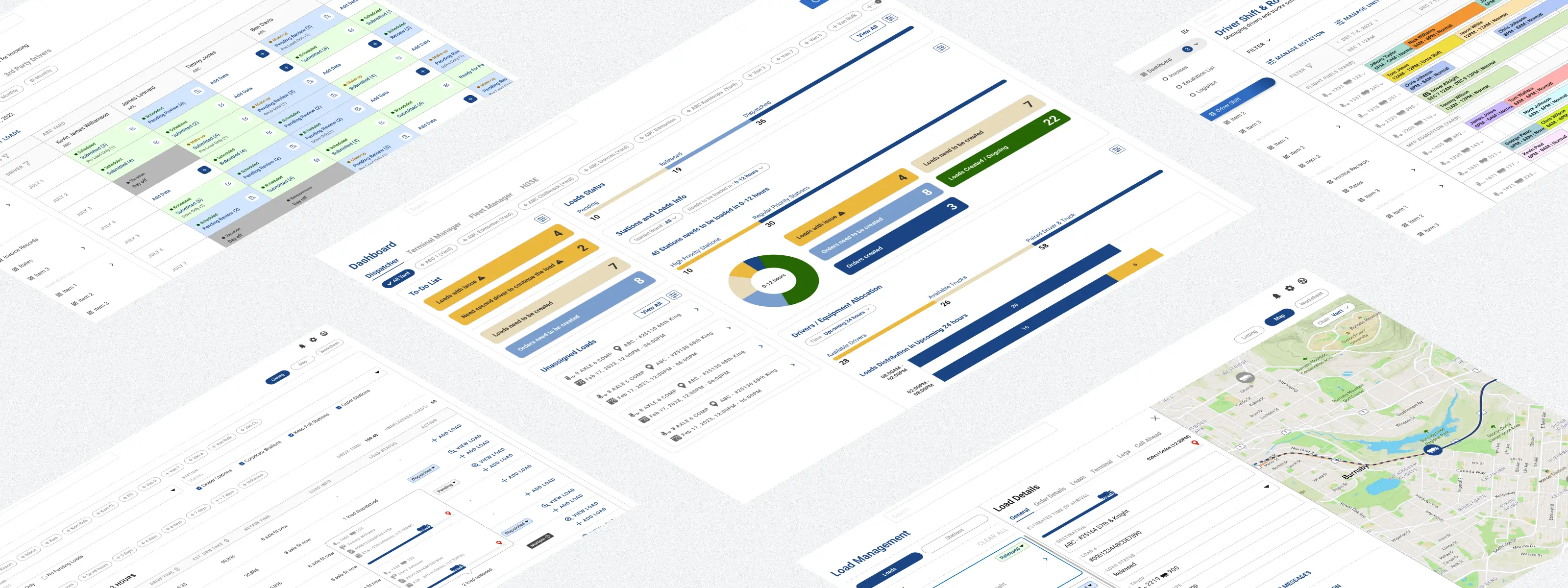
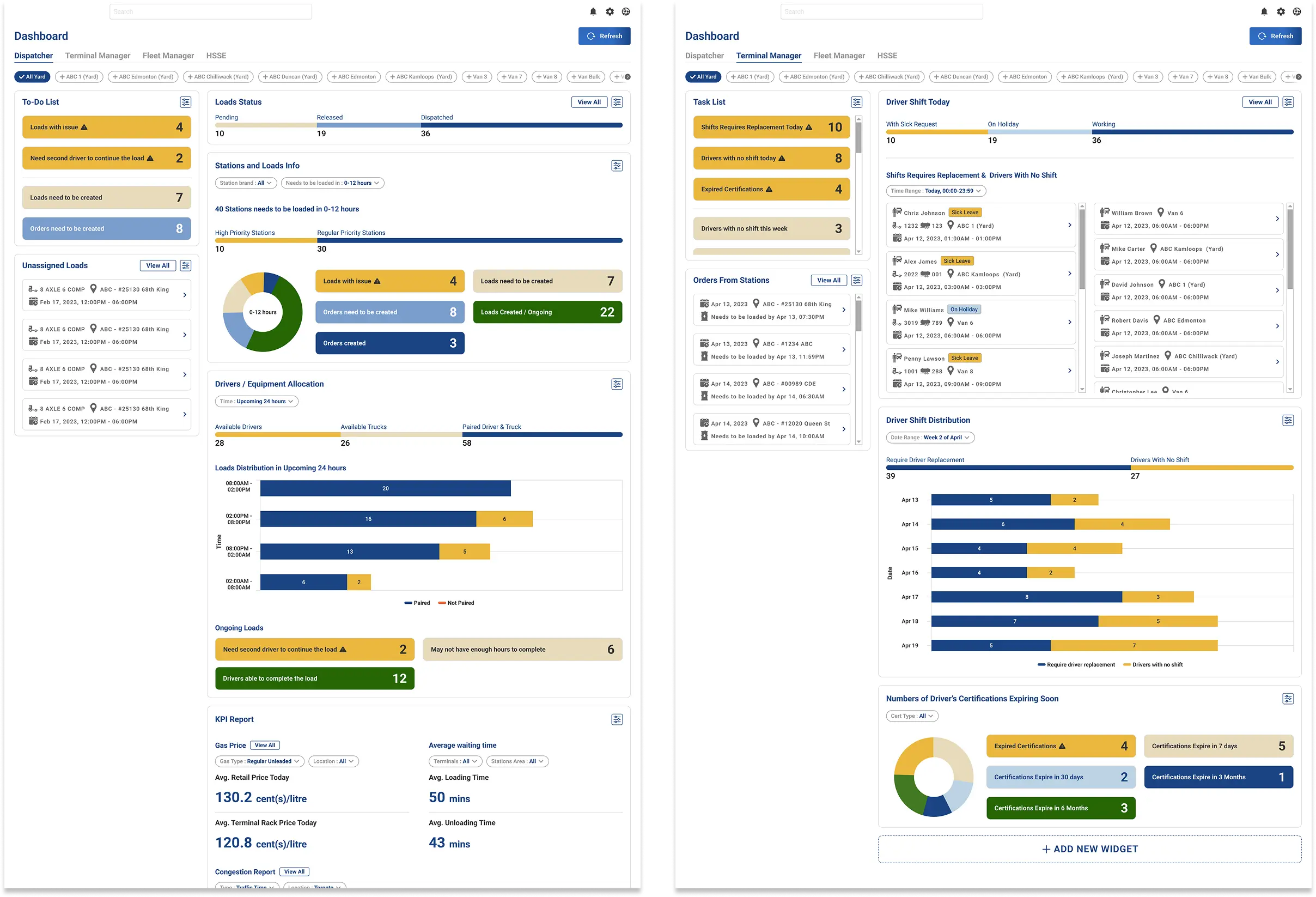
The platform was built around three types of users with different priorities, so the design had to work differently depending on who was logged in. Ops managers needed situational awareness, dispatchers needed to act fast, and finance needed accurate data to close out billing. So instead of one generic interface, I designed role-specific dashboards for four user roles, each showing the widgets that actually mattered for that person's day. One detail worth mentioning is the To-Do List widget, tasks are highlighted by urgency level so users can triage their workload at a glance without hunting through menus.
Dashboard
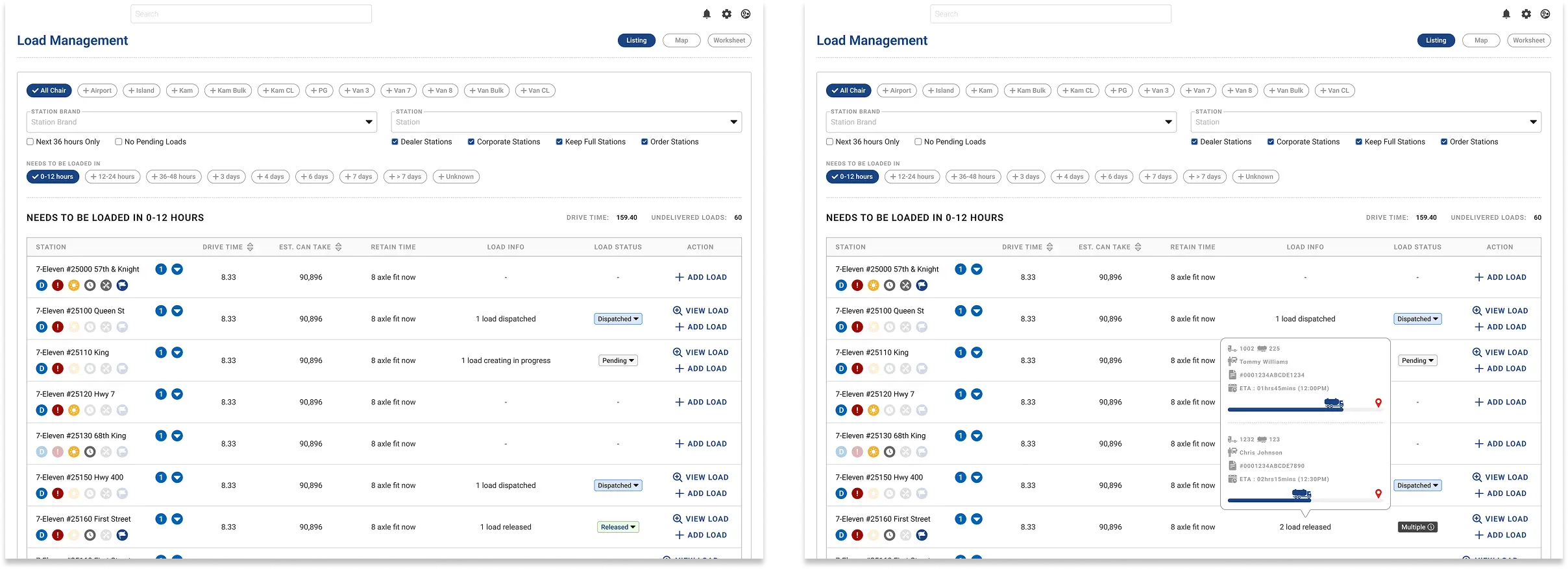
Load Management has two views. The station listing shows which fuel stations need a delivery in the next 0 to 12 hours, 12 to 24 hours, or further out, along with whether a delivery is already in progress or scheduled. Each station has a small set of icon indicators for special requirements, like daytime-only arrival windows or specific driver licensing. The map view shows all active trucks in real time. There's a driver list on the side with key details for each run. Clicking a driver opens a load details panel that sits alongside the map rather than on top of it, so dispatchers can read the trip details and watch the truck's position at the same time.
Load Management
.webp)
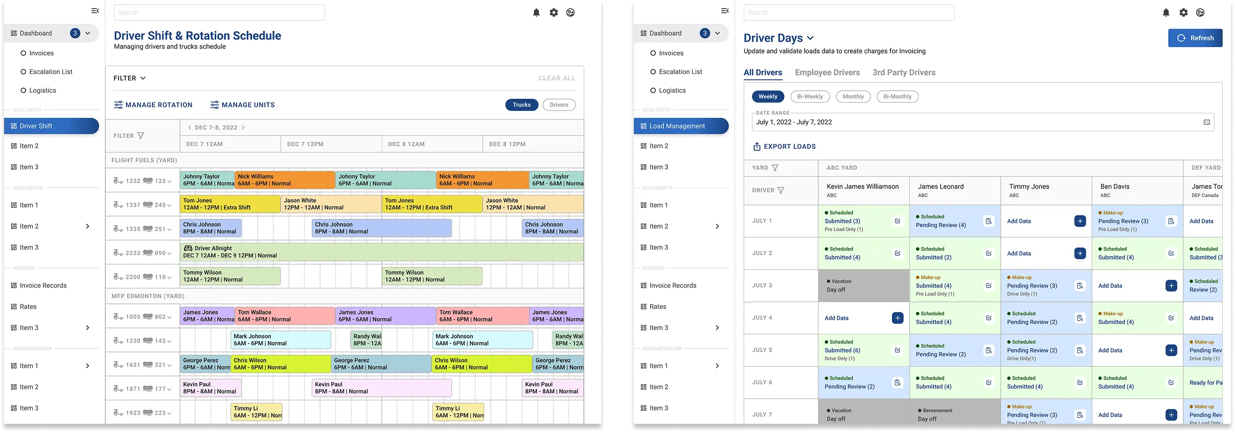
For scheduling, I used a Gantt chart where every driver and truck keeps the same colour block across the whole timeline. Same driver, same colour every time. It makes conflicts and patterns visible without having to read each label carefully. There's also a Check Availability function that surfaces drivers with no active shifts so dispatchers can assign them quickly. On the finance side, Driver Days gives the team a grid of every driver's shifts across a date range. Each day is colour-coded by status, submitted, pending review, day off, or empty, and a small tag inside each cell shows whether it's a scheduled or make-up shift. The team can filter by employee drivers or third-party drivers, and can see exactly what needs reviewing without opening records one by one.
Drivers Shift & Driver Days
Key Decisions
04
Keep the load details panel open beside the map
Dispatchers needed to check trip details and still keep an eye on where the truck was. A full-screen modal would have broken that flow, so I kept the details in a side panel instead. That way they could stay oriented on the map while still reviewing the load.
1
Use colour as a quick sorting system in Driver Days
The finance team had to review a lot of shift data before charges could be created, so the grid needed to do some of the filtering work visually. I used status colours for submitted, pending review, day off, and empty. I also added small shift tags inside each day cell so users could tell scheduled shifts from make-up shifts without opening each record.
2
Make dashboards role-specific
The four dashboard views were not identical, because the work was not identical. Ops managers, dispatchers, finance users, and other roles all needed different widgets and priorities. The goal was to give each role a dashboard that felt useful right away instead of forcing everyone through the same layout.
3
Outcome
05
By the end of the project, the client moved from two disconnected tools into one platform that supported operations, dispatch, and finance in one place. That reduced the manual handoff between teams, cut down the amount of duplicate data entry, and gave the business better visibility into what was happening across drivers, stations, and billing.
It also introduced a few capabilities the team did not really have before, especially live driver tracking and role-specific dashboards. For me, this project is a good example of designing for operational complexity without making the interface feel overloaded. It also shows the kind of B2B work I want to keep doing: taking messy workflows used by different teams and turning them into something clearer, faster, and easier to run.
It also introduced a few capabilities the team did not really have before, especially live driver tracking and role-specific dashboards. For me, this project is a good example of designing for operational complexity without making the interface feel overloaded. It also shows the kind of B2B work I want to keep doing: taking messy workflows used by different teams and turning them into something clearer, faster, and easier to run.